I design end-to-end campaigns across digital, print, and event materials, building scalable systems optimized for impact and performance. I bring precision and creativity to every brief through experience in lightweight motion design, AI-assisted production, and cross-functional collaboration, working fluently across English and French. Originally from Paris and now based in Orlando, I am currently available for freelance projects that push creative boundaries.
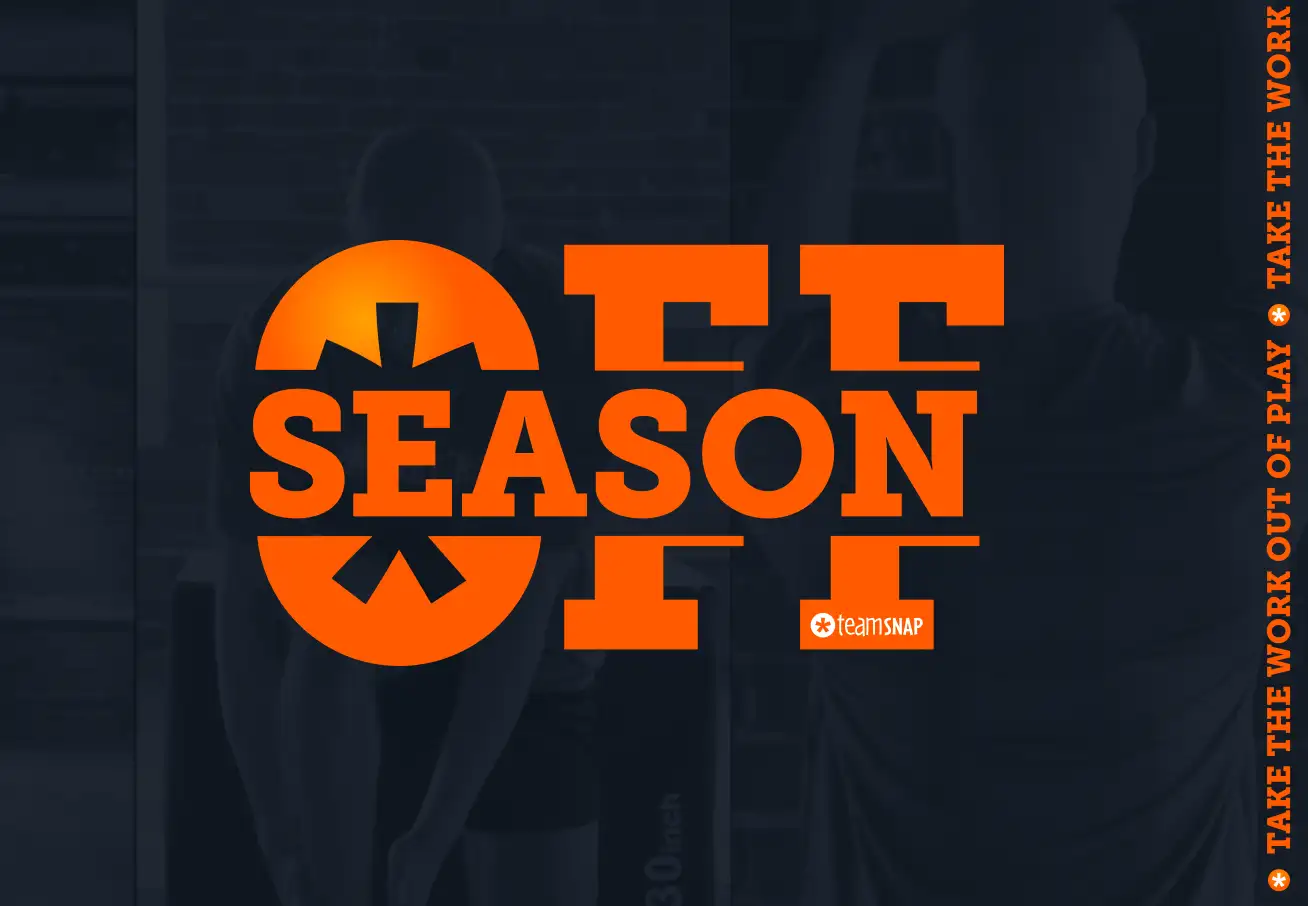
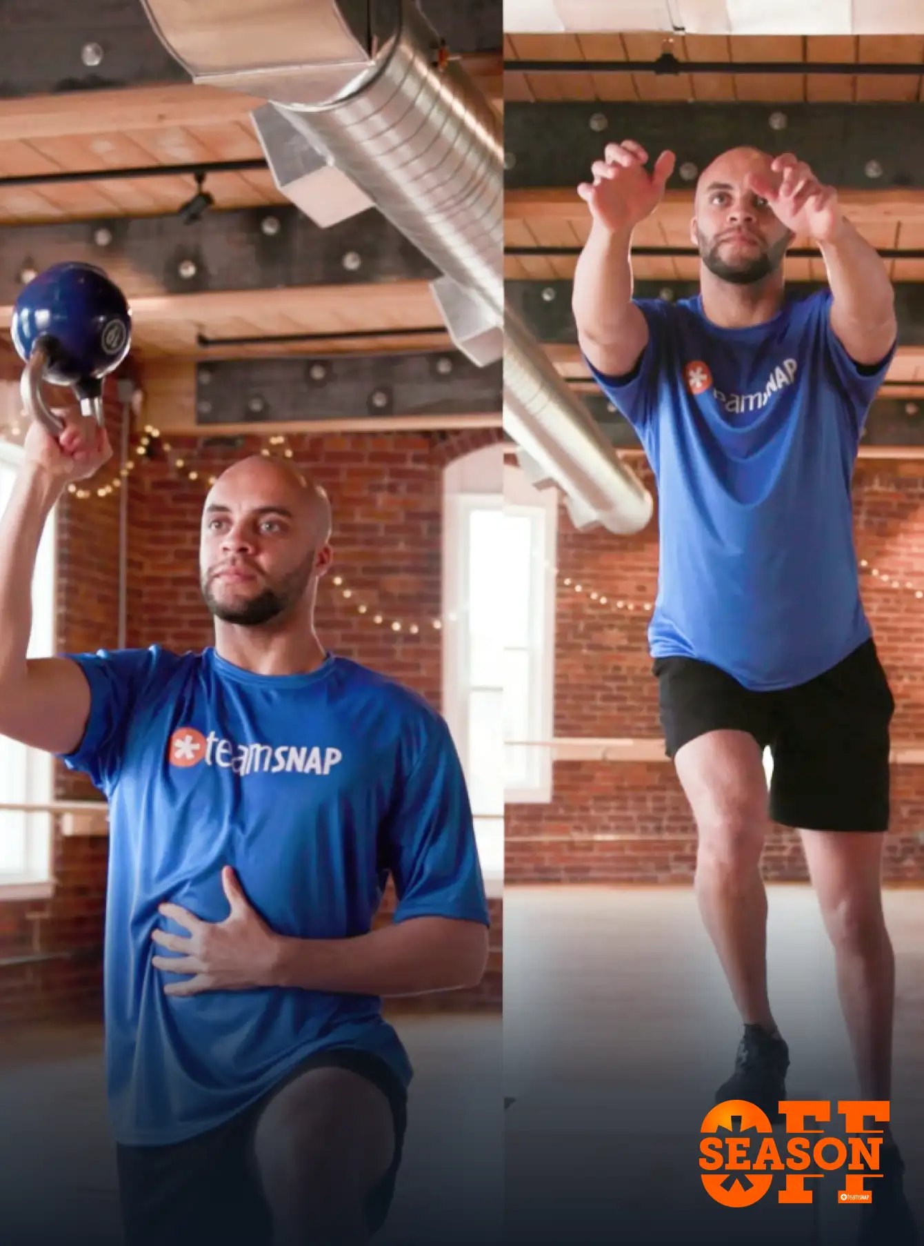
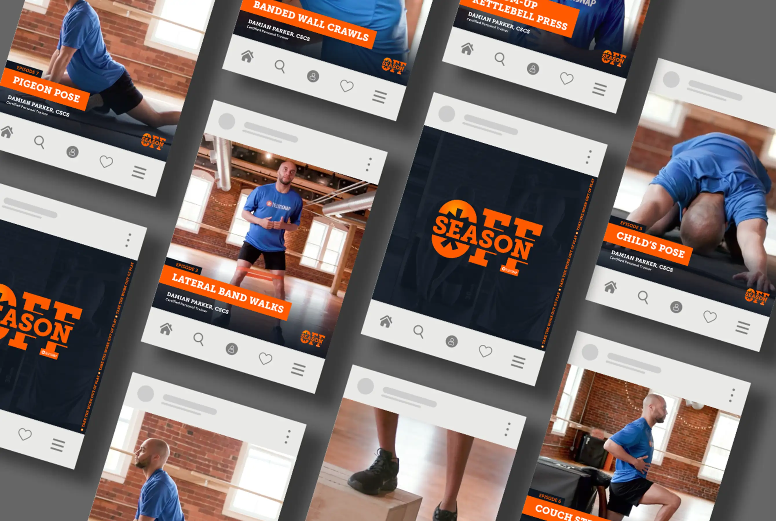
Off-season is the period between competitive seasons when young athletes step away from structured team play. Depending on the sport and region, this window varies, but the opportunity it creates is consistent: time to build strength, refine technique, and develop the mobility habits that carry athletes into their next season stronger and more prepared.
Develop a campaign that gives coaches, parents, and sports organizations practical resources to keep young athletes engaged, active, and progressing during the off-season.
A multi-channel campaign built around expert-led content and a structured release format, delivered through:
Each channel was designed to work together, with social ads driving awareness, emails nurturing engagement, and the landing page serving as the destination for action.
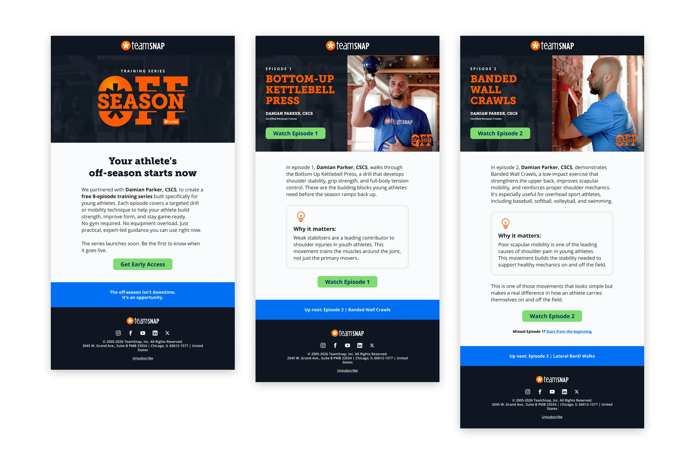
At launch, the campaign drove strong engagement on the landing page, with a notable number of visitors signing up for resources and creating new teams. The structured email series and social ad cadence helped sustain momentum across the campaign window, keeping the audience engaged well beyond the initial launch.

Connecting the world of youth sports.
TeamSnap is a platform that helps sports teams, clubs, and leagues manage communication, scheduling, rosters, payments, and more. It serves coaches, parents, players, and league administrators, simplifying the logistics of youth sports so organizers can focus on what matters most: the game.
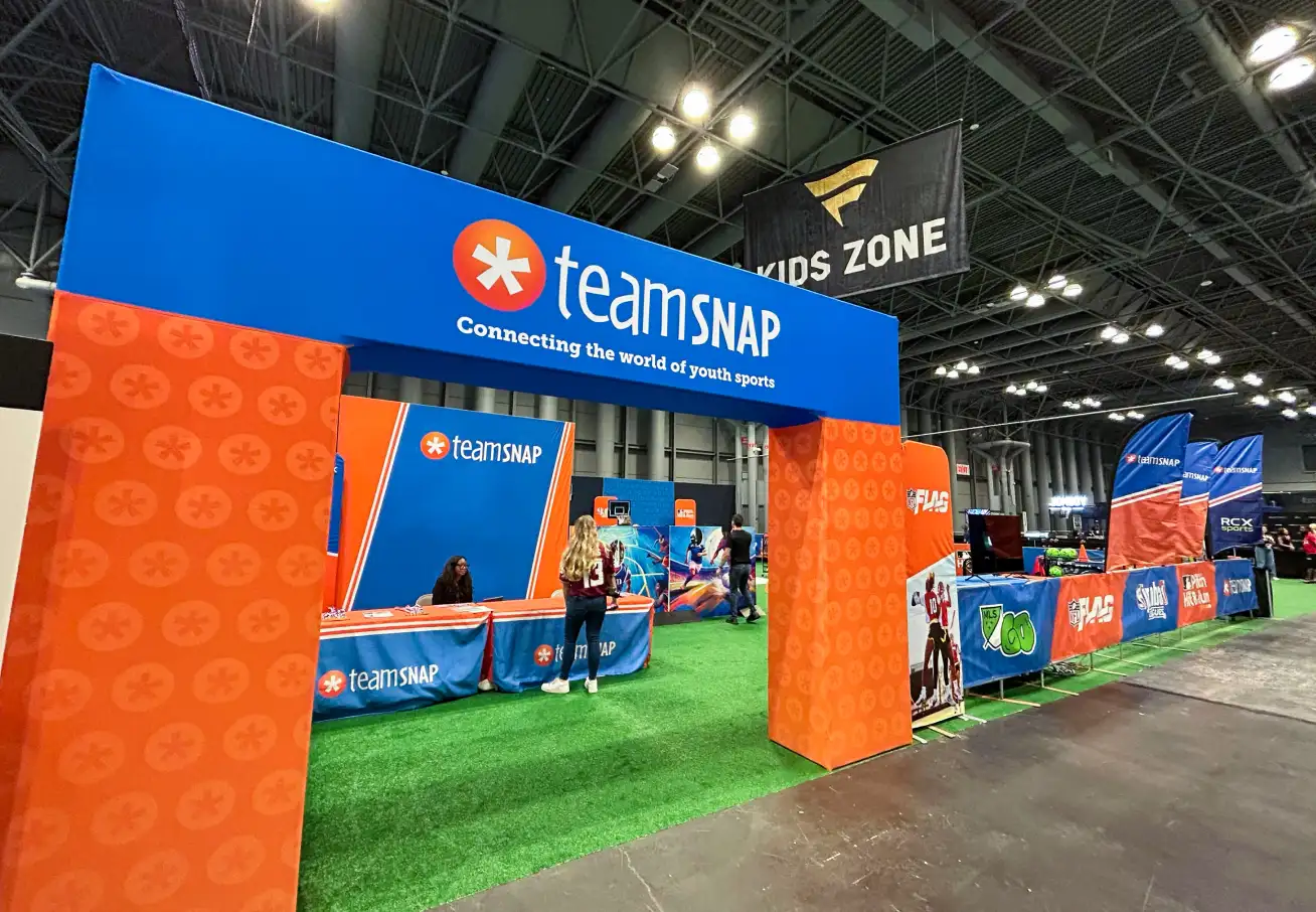
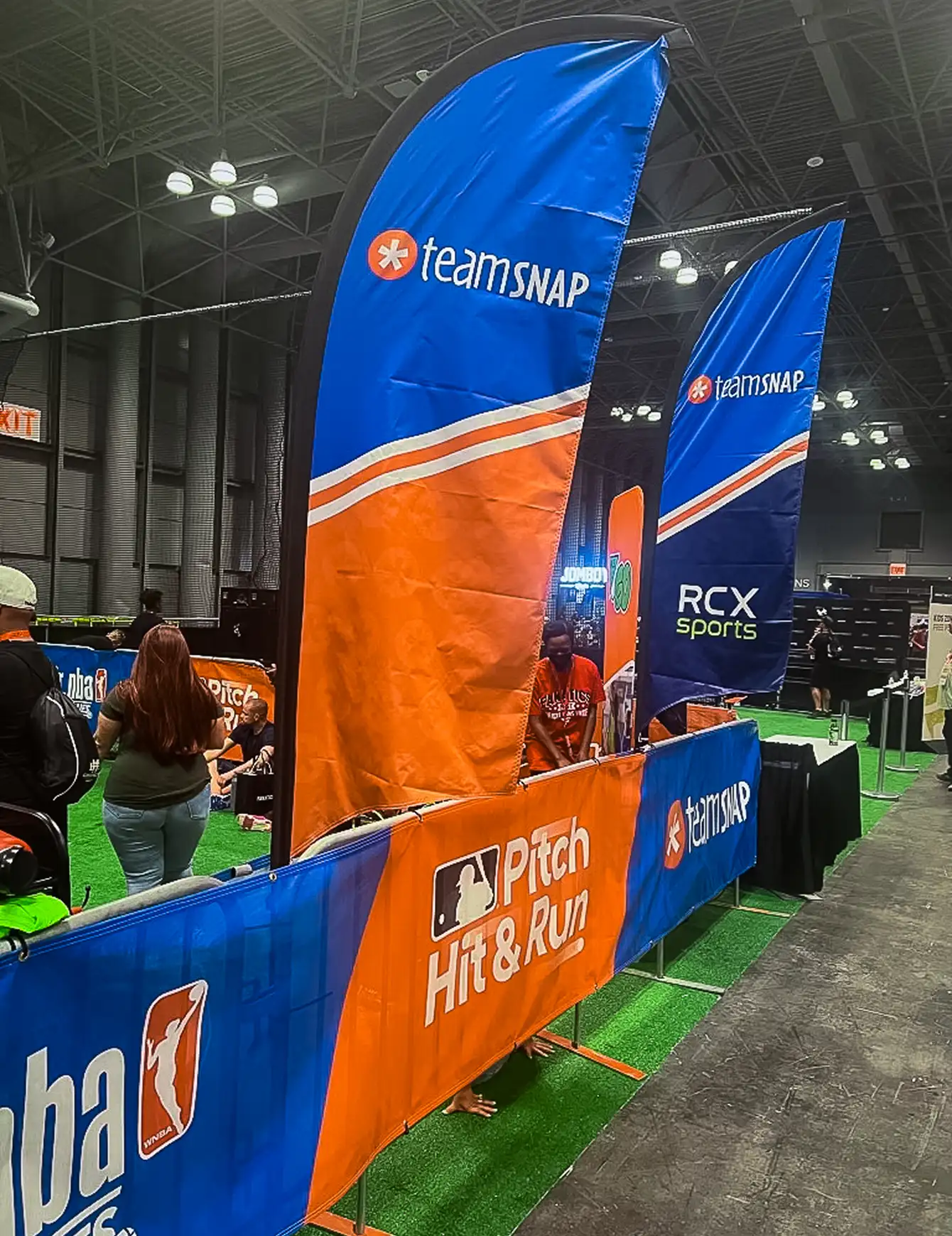
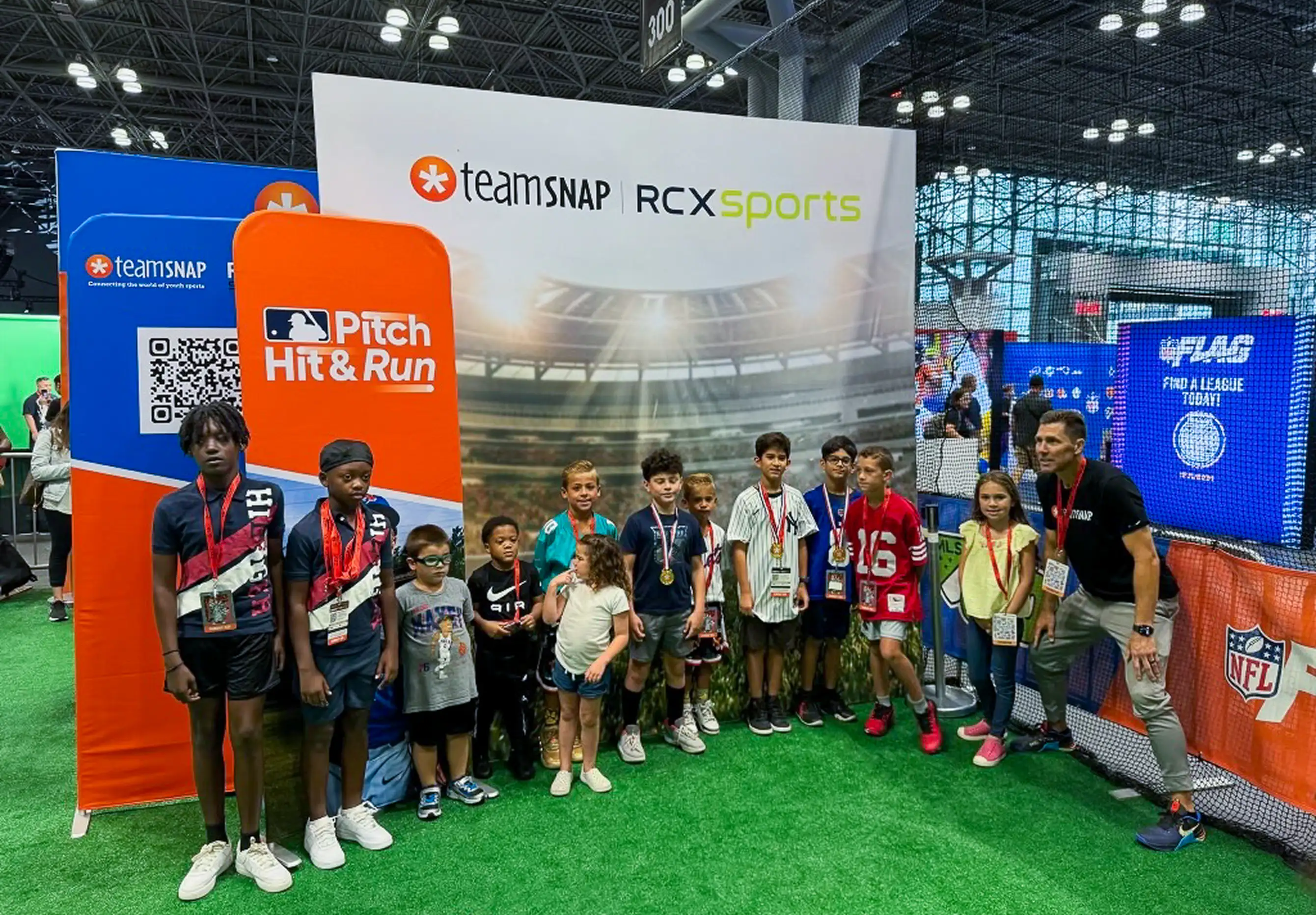
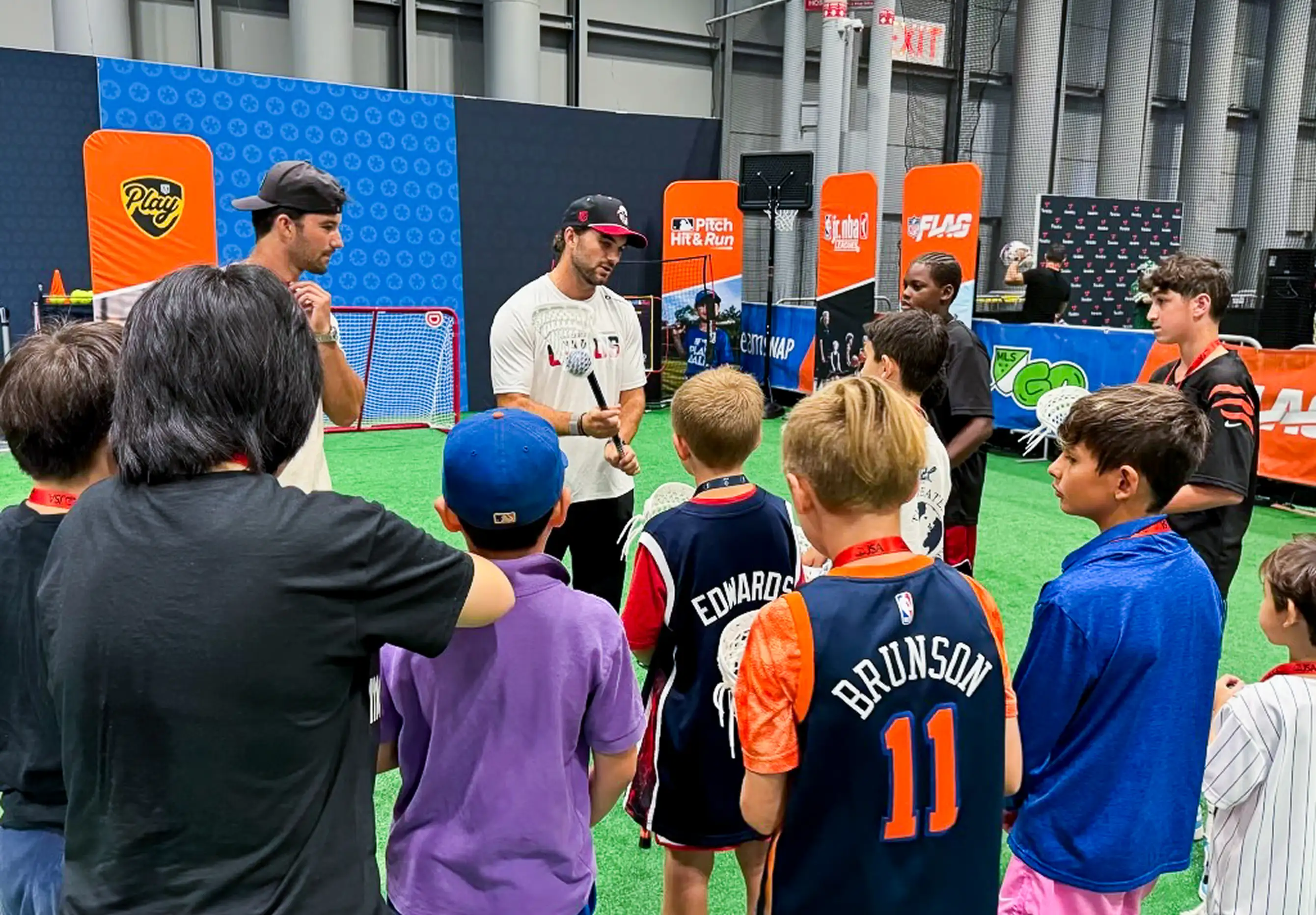
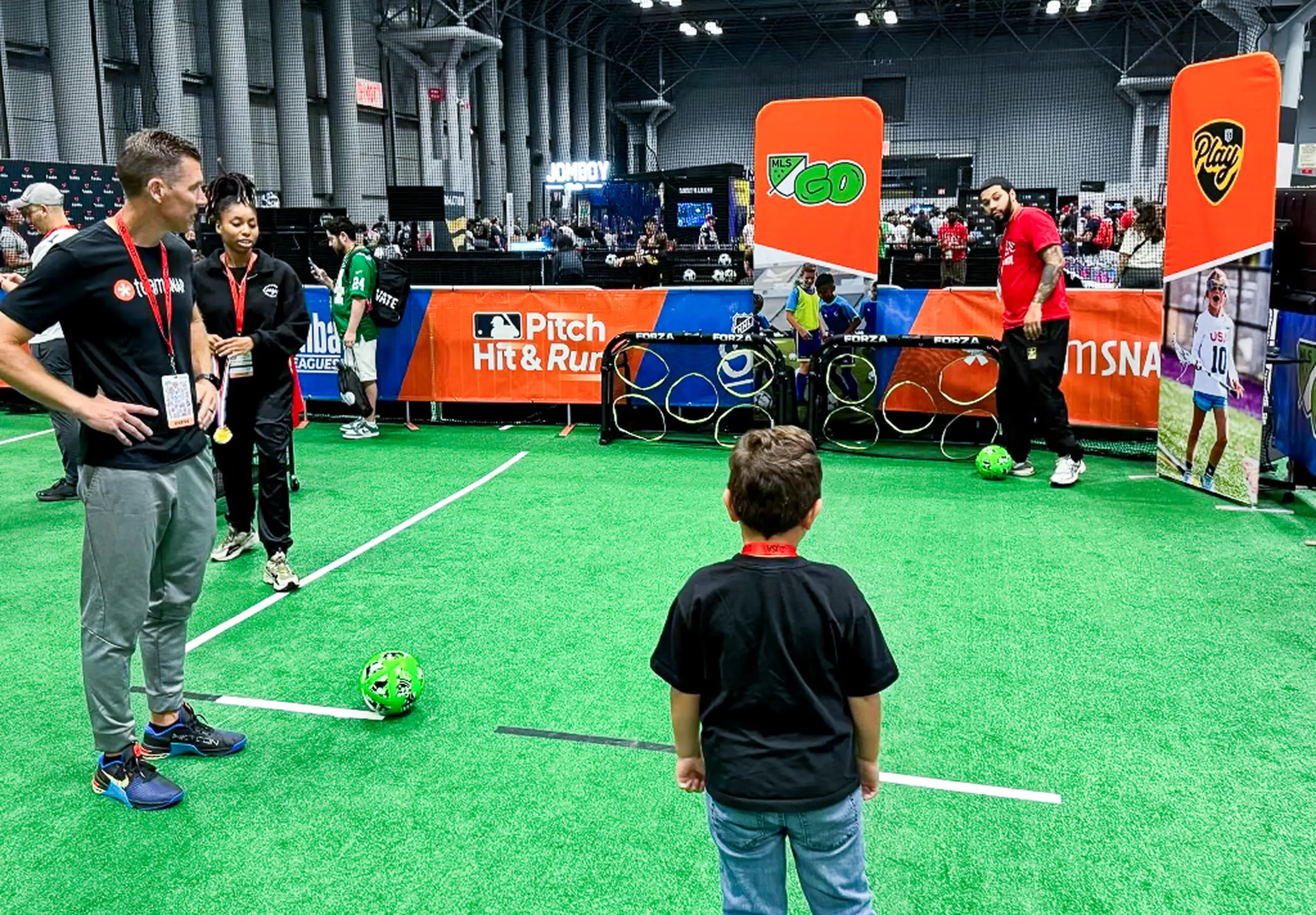
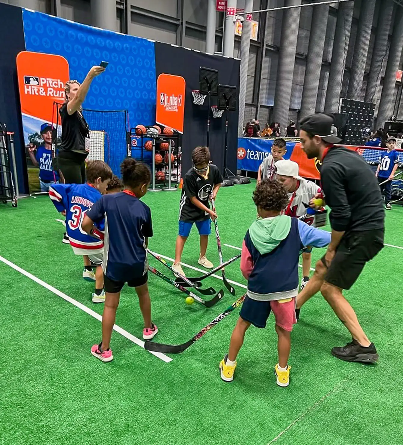
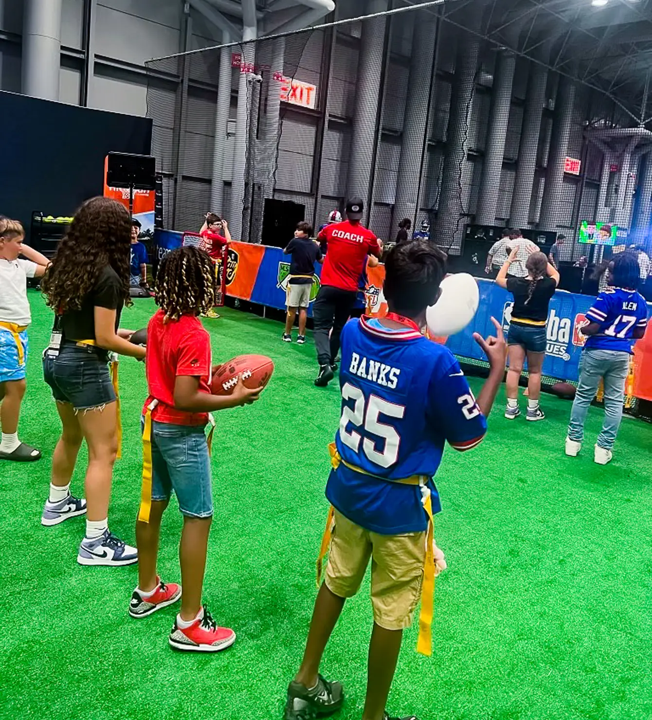
TeamSnap participated in the first-ever Fanatics Fest in New York City (August 16–18, 2024), hosting the Kids Zone across all three days. The space was designed to give kids a hands-on sports experience, featuring basketball hoops, soccer goals, lacrosse sticks, baseball gloves, and footballs. The goal was simple: help as many kids as possible discover the joy of sports and leave with a memory tied to the TeamSnap brand.
Designing an effective event presence for TeamSnap required thinking well beyond visual branding. The booth needed to function as an experience, not just a display. In a large, high-traffic environment like Fanatics Fest, the space had to work hard to draw families in, hold their attention, and communicate the brand's purpose in a way that felt natural rather than promotional. The challenge was creating something that resonated equally with kids who wanted to play and parents who make decisions about the tools and platforms they trust for their athlete's team.
The booth design prioritized an open layout that invited exploration rather than directing foot traffic toward a sales interaction. Clear visual hierarchy across backdrops, banners, and signage ensured instant brand recognition from across the floor. TeamSnap's brand, and messaging were applied consistently across every touchpoint to create a cohesive, professional presence.
The Kids Zone served as the heart of the activation. Instead of passive product demos, kids were encouraged to move, compete, and explore across multiple sport stations. This kept energy high and gave families a genuine reason to stay longer. A dedicated photo backdrop gave attendees an organic moment to stop and capture a memory, creating shareable content that extended the campaign's reach well beyond the event itself. Every design decision, from the layout to the signage scale to the flow between activity stations, was made with both the child's experience and the parent's perspective in mind.
I didn’t create this video—it's just to show you the actual installation of the booth.
TeamSnap's presence at Fanatics Fest reinforced its position as a trusted partner in the youth sports community. The Kids Zone drew consistent traffic across all three days, giving the team meaningful face time with coaches, parents, and young athletes. The experiential format created genuine brand moments that a traditional booth setup would not have achieved.
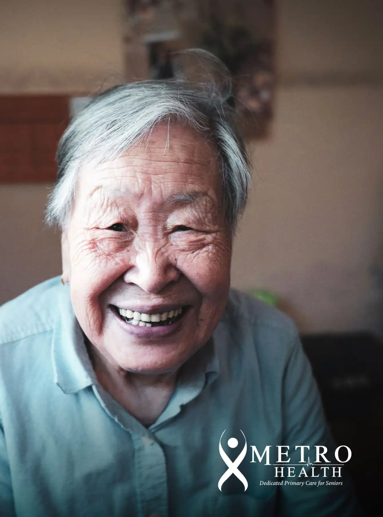
Metro Health is a geriatric healthcare provider focused on improving the health and quality of life for older adults. They offer personalized, compassionate care built around wellness, comfort, and longevity, working closely with seniors and their families to support healthier, more fulfilling lives.
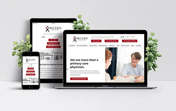
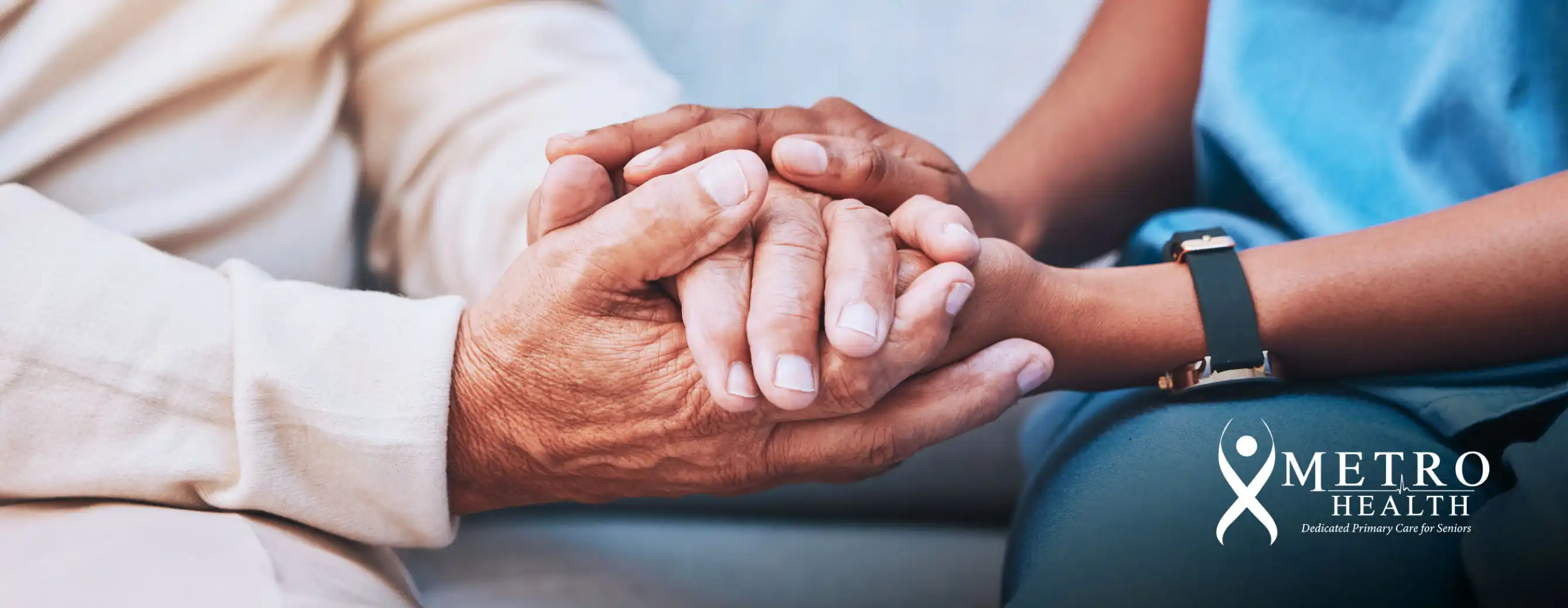
Redesign the Metro Health website to meet the specific needs of an elderly user base without compromising the brand's visual identity. The site needed to balance modern design standards with strong readability, intuitive navigation, and accessibility, while reflecting the organization's commitment to exceptional geriatric care.
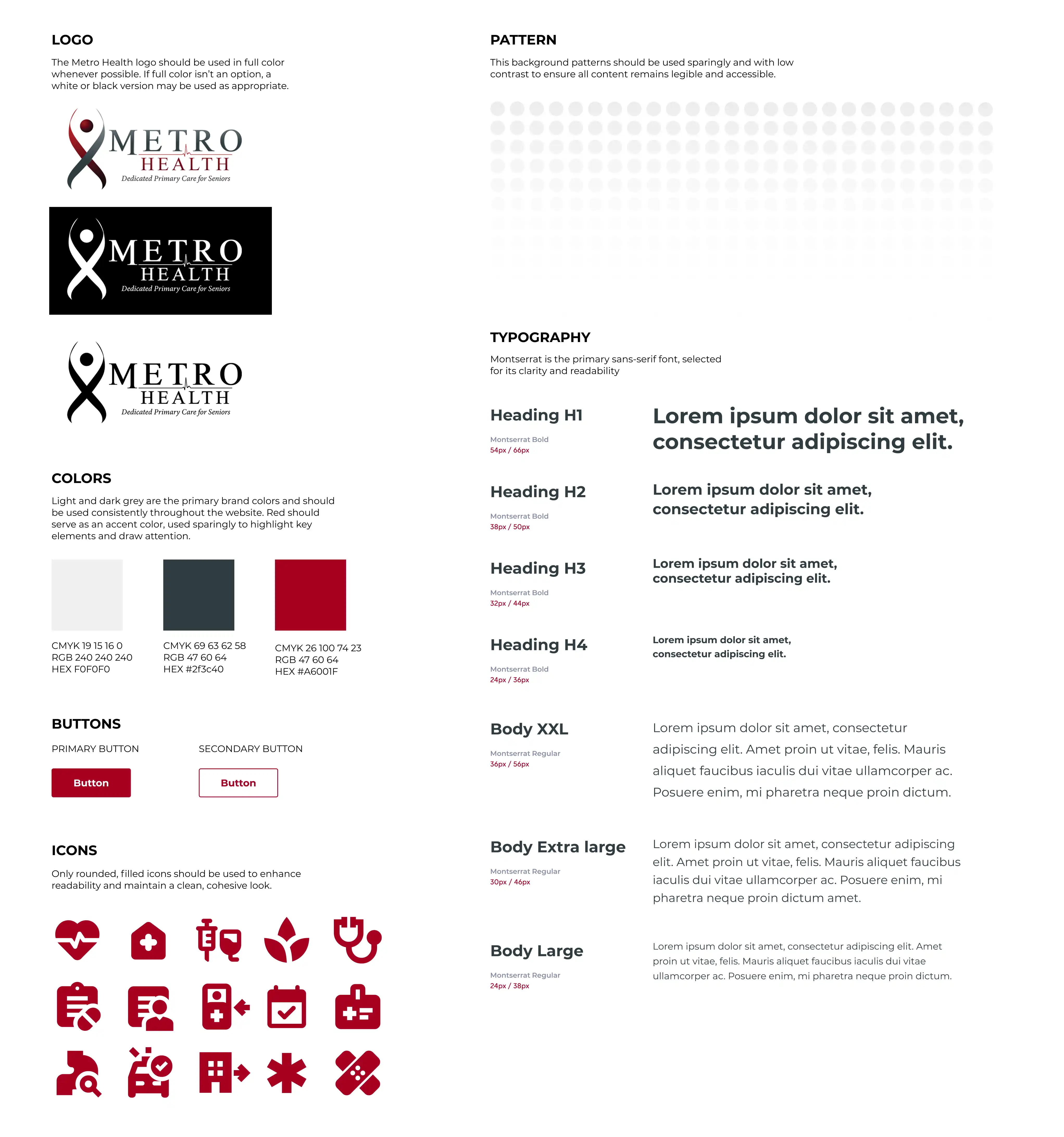
The redesign prioritized clarity and accessibility at every level. A clean, uncluttered layout with generous white space reduces cognitive load and makes content easy to scan. Brand colors and visual identity are applied consistently throughout, maintaining recognition while supporting a more refined, modern aesthetic.
With seniors as the primary audience, every design decision was made with legibility and ease of use in mind. Large, high-contrast typography improves readability across screen sizes, while simplified navigation and clearly labeled buttons reduce friction for users less familiar with digital interfaces. Accessibility features including adjustable text size, contrast settings, and voice-assisted support ensure the site works across a wide range of needs and abilities.
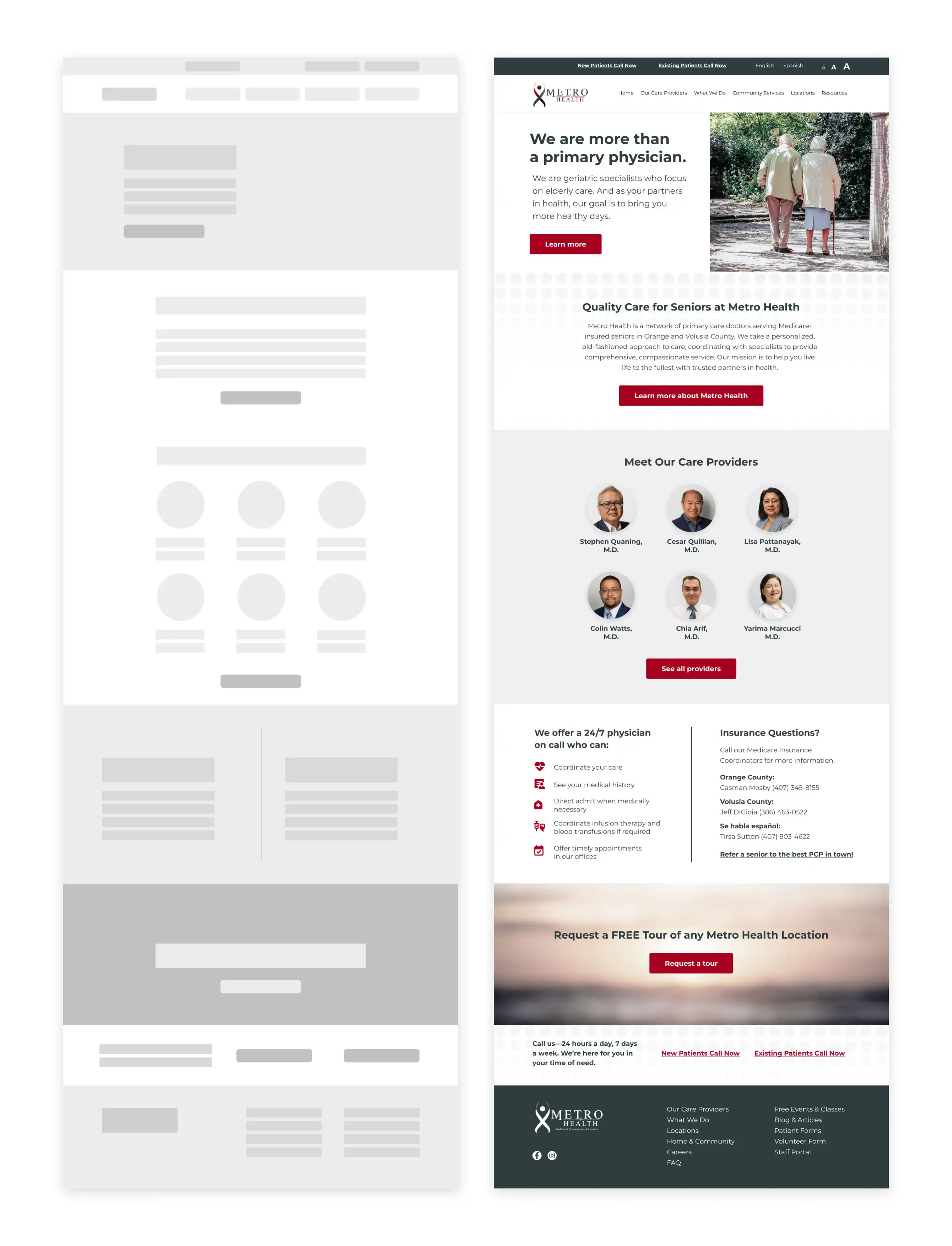
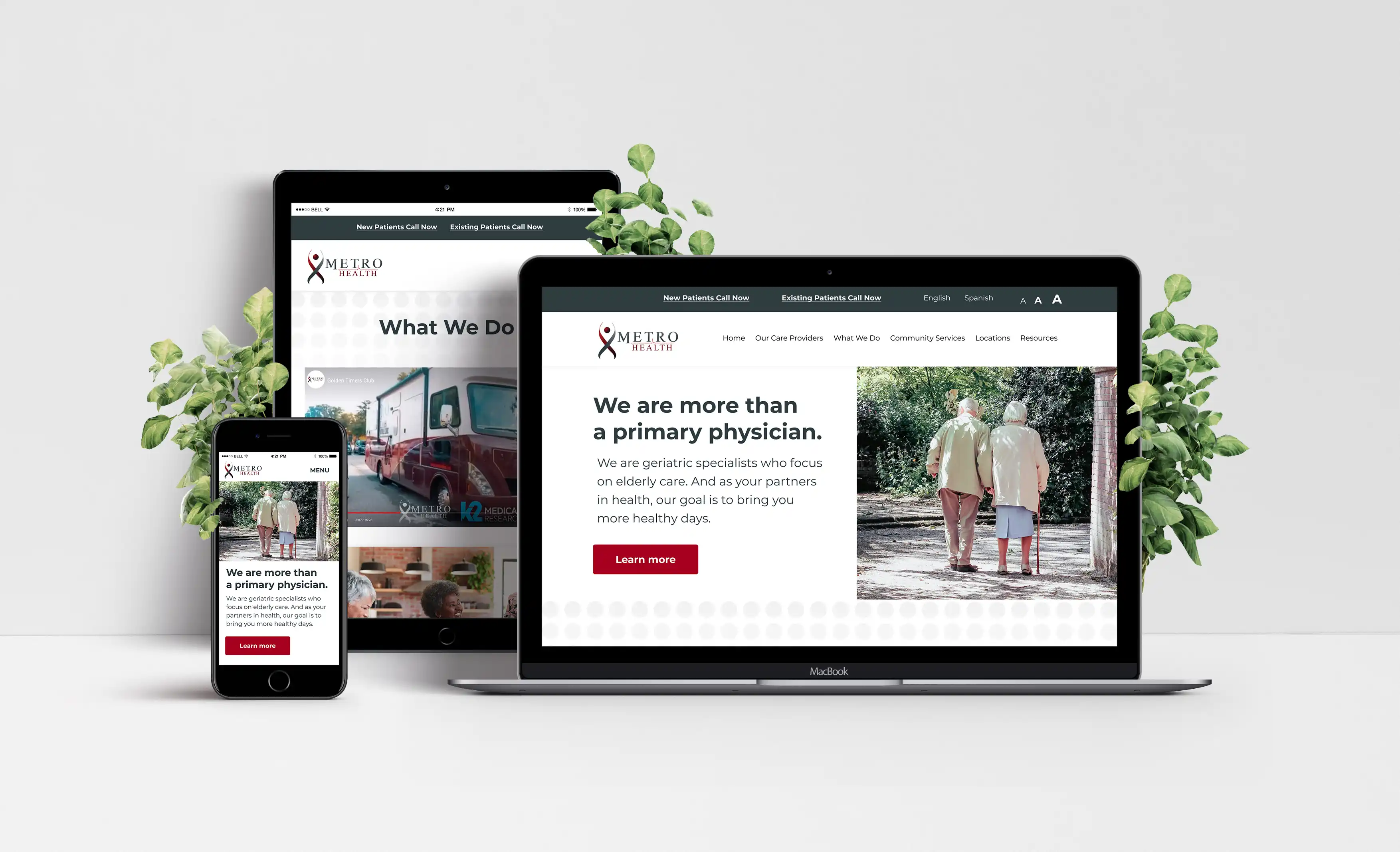
Post-launch analytics reflected a meaningful improvement in user engagement. The homepage saw strong traffic volume alongside a notable increase in resource views, form downloads, and event page visits. A low bounce rate indicated that visitors were not just arriving but staying to explore, a strong signal that the redesign successfully improved usability and encouraged interaction across key areas of the site.
A culinary journey
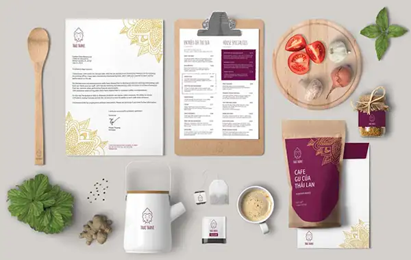
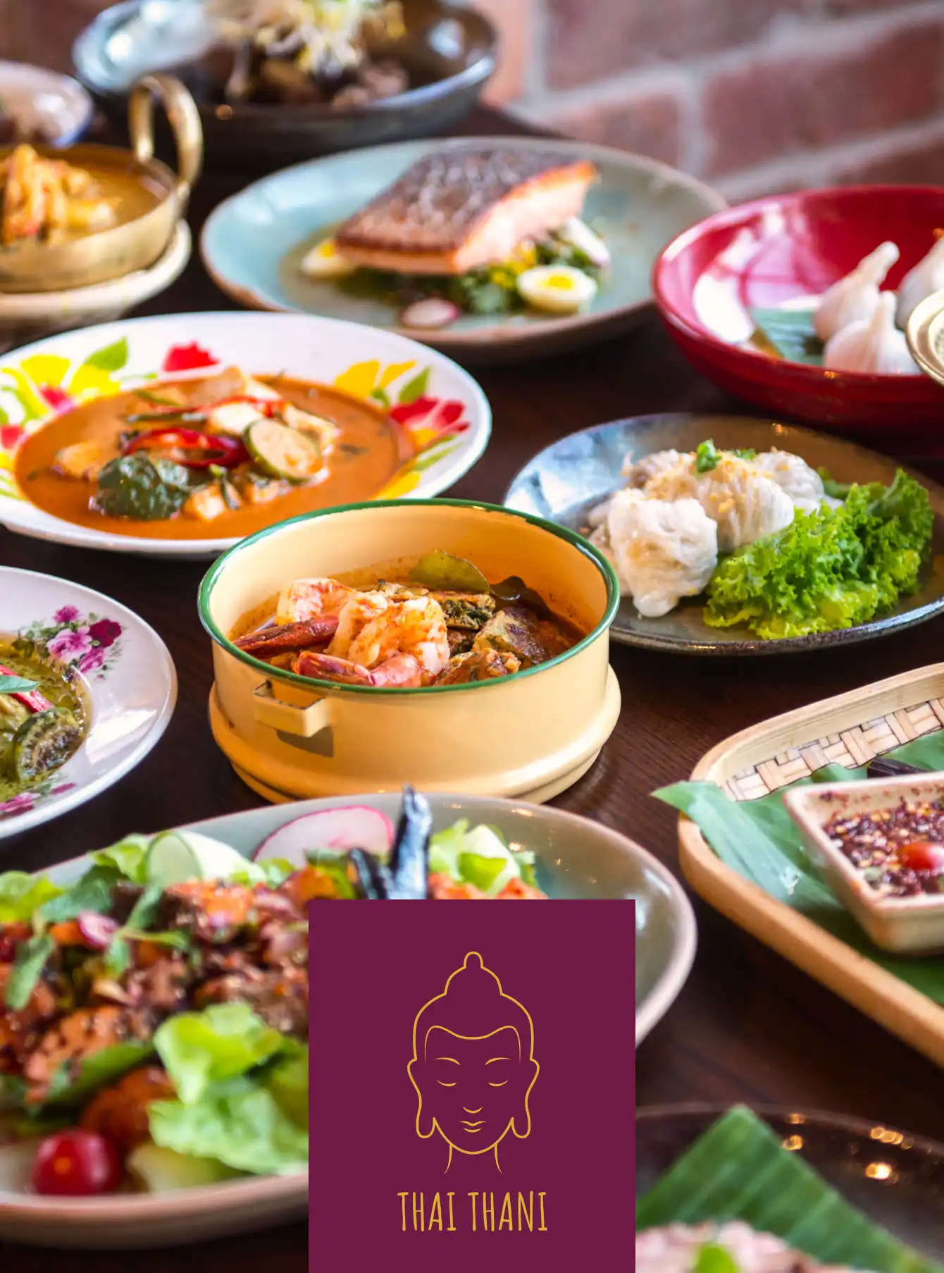
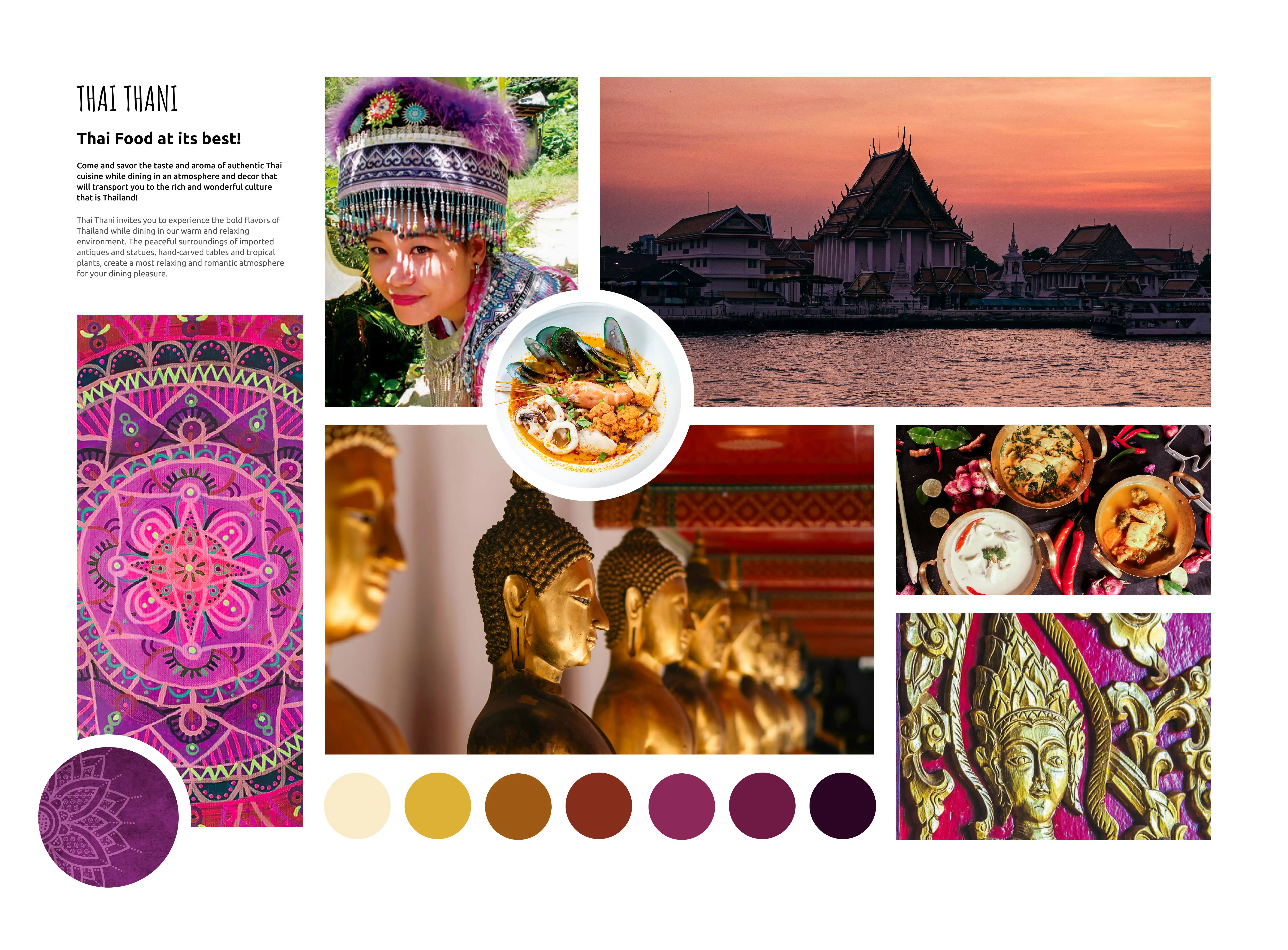
Thai Thani is a highly-rated Thai restaurant in Orlando known for its elegant, traditional atmosphere and cultural programming, including Thai classical dancing on weekends. The restaurant has built a loyal following through its commitment to authentic cuisine and an immersive dining experience that honors Thai heritage.
Modernize the Thai Thani visual identity without losing the cultural authenticity that defines the brand. The rebrand needed to feel fresh and relevant to contemporary audiences while remaining deeply respectful of the Thai heritage, traditions, and values at the core of the restaurant's identity.
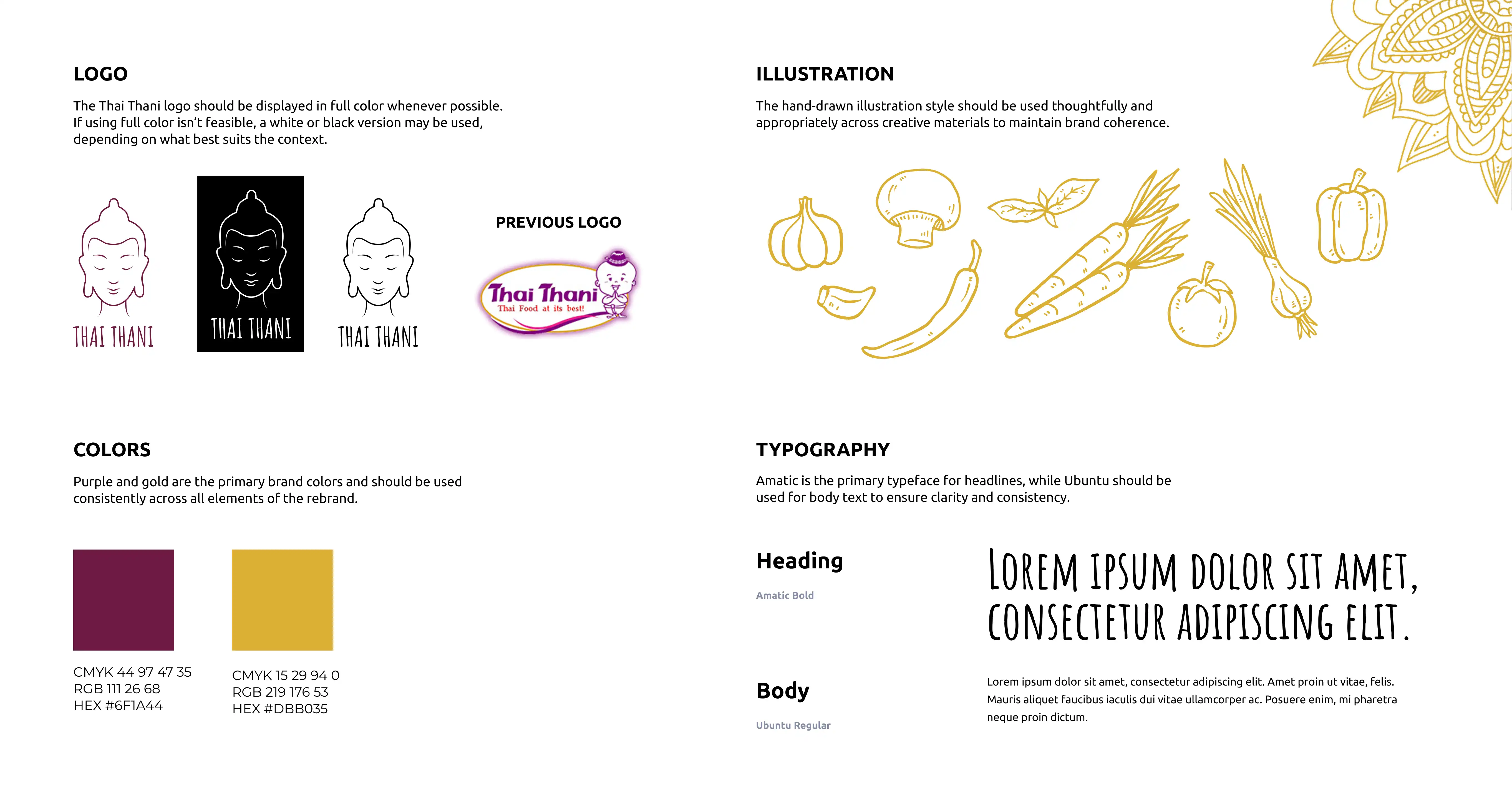
The rebrand centered on finding the intersection between modern design and cultural richness. The logo was refined to a cleaner, more contemporary form while retaining visual references to traditional Thai motifs. The core color palette of gold and purple was preserved and refined, reinforcing brand recognition while continuing to evoke the elegance and depth of Thai tradition.
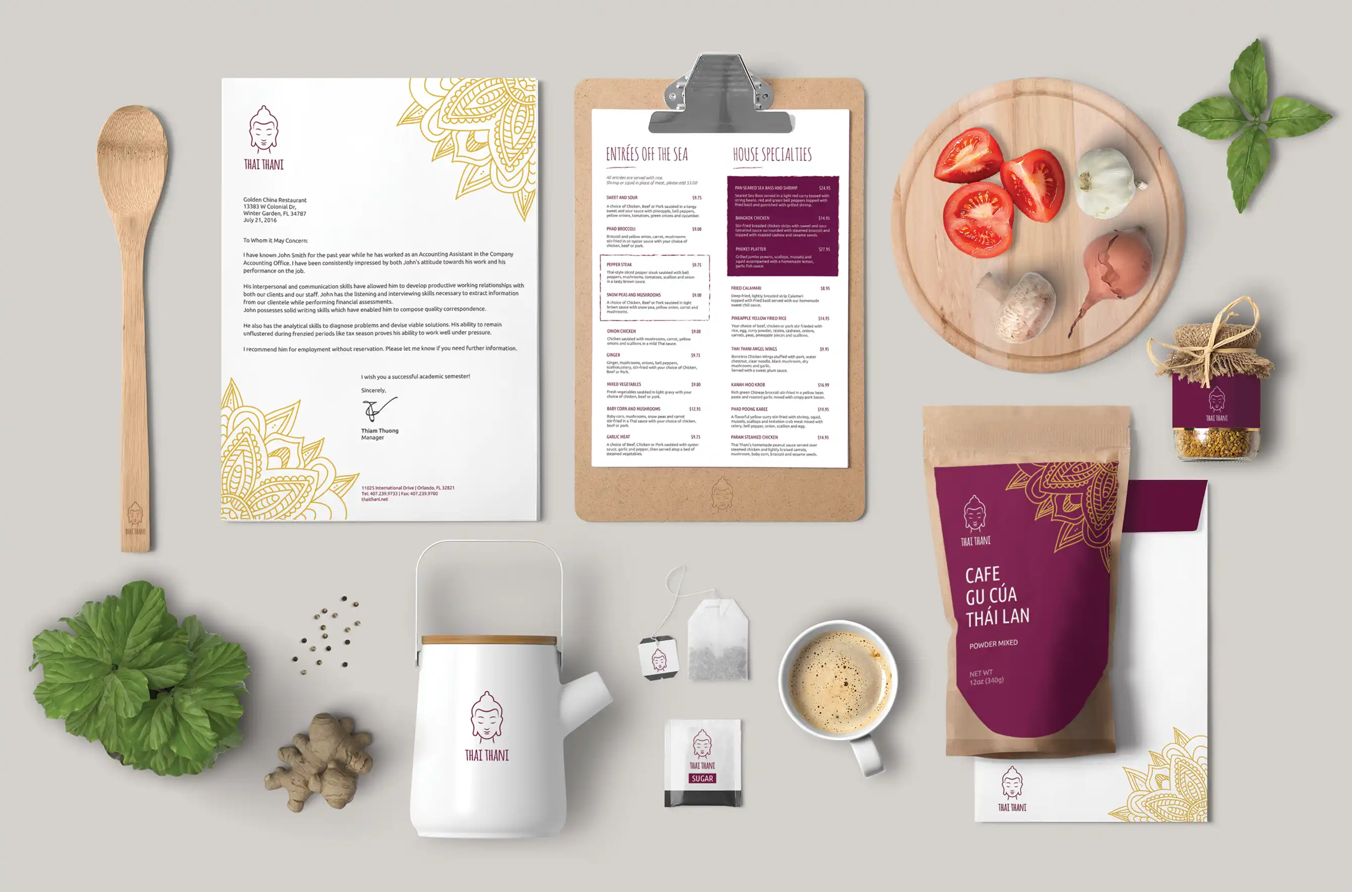
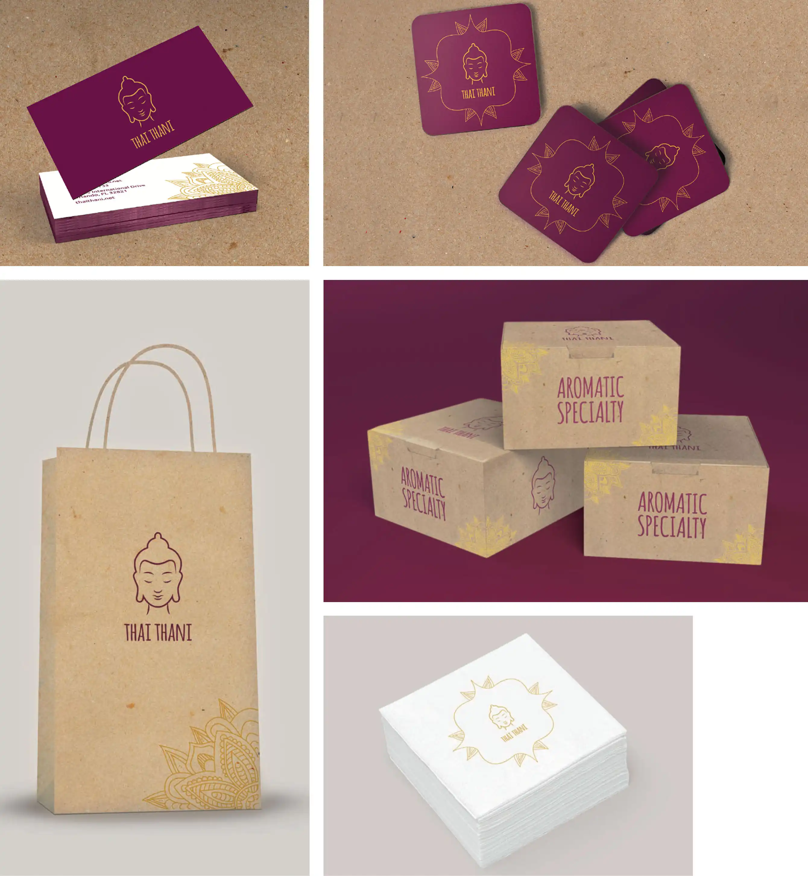
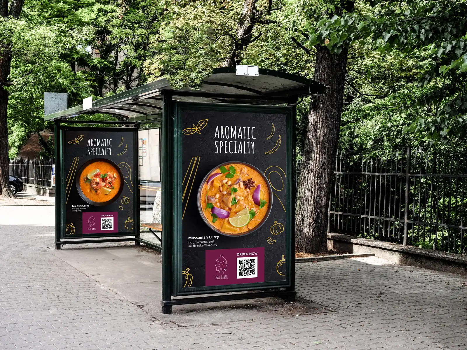
Packaging and promotional materials were redesigned with storytelling at the forefront, incorporating traditional patterns, culinary references, and cultural details that give each touchpoint a sense of meaning beyond aesthetics. The result is a cohesive visual system that works consistently across menus, packaging, and digital platforms, giving the brand a more polished presence without sacrificing its roots.
The rebrand successfully elevated Thai Thani's visual identity by balancing contemporary design with the timeless elegance of Thai culture. The refined logo, updated color application, and redesigned collateral created a more cohesive and emotionally resonant brand experience across every touchpoint. The updated identity positions Thai Thani to connect with a broader audience while remaining true to the heritage and hospitality that have always set it apart.
Fictitious Company | Branding
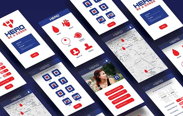
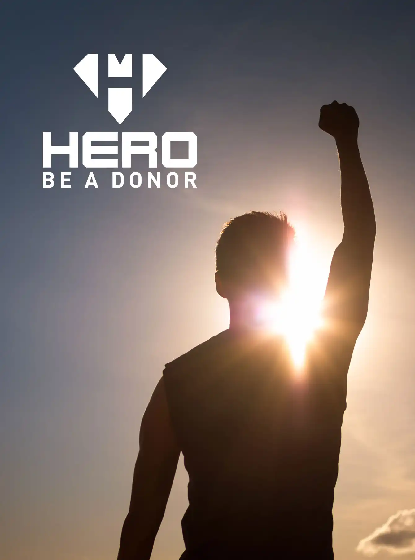
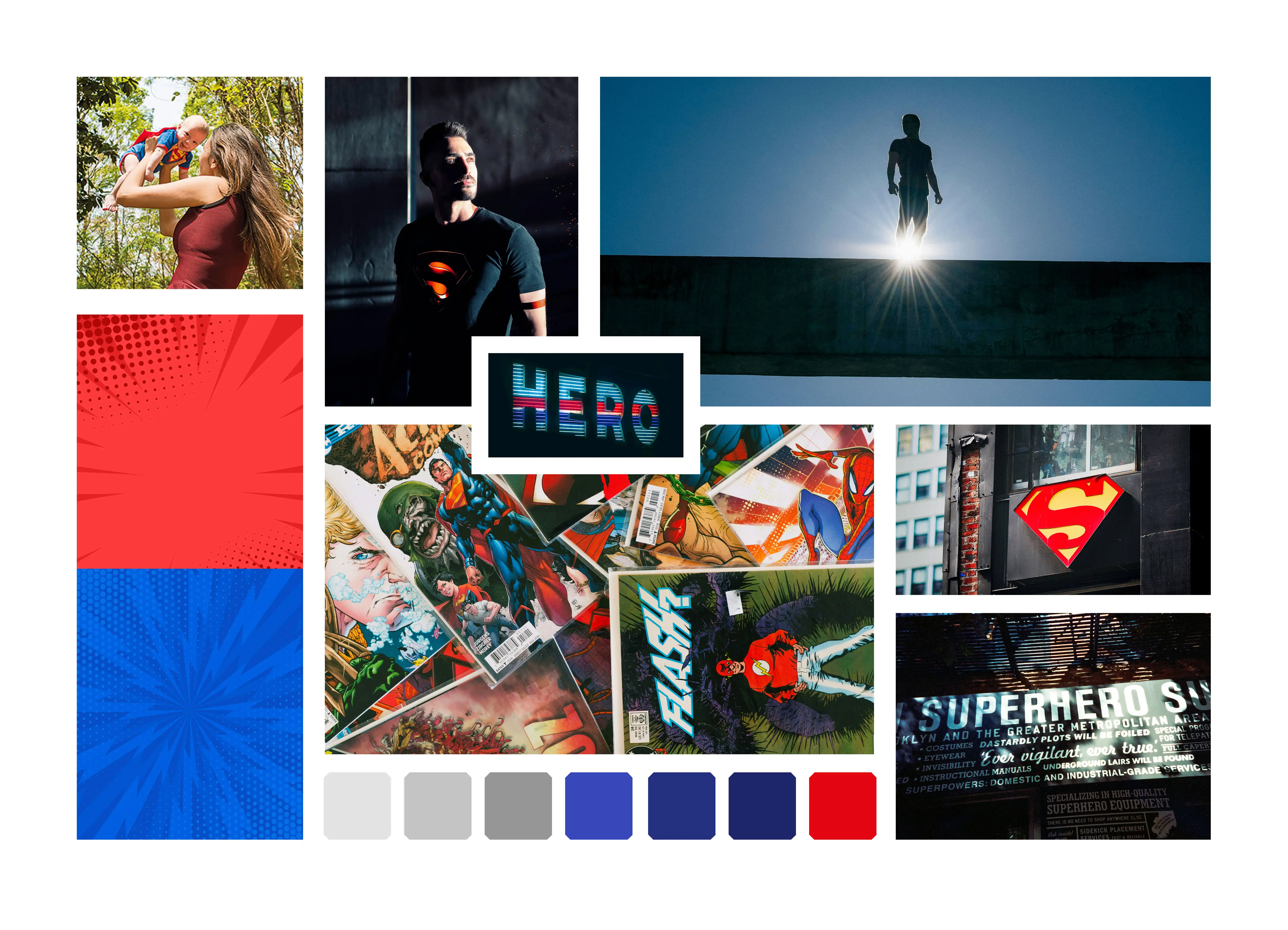
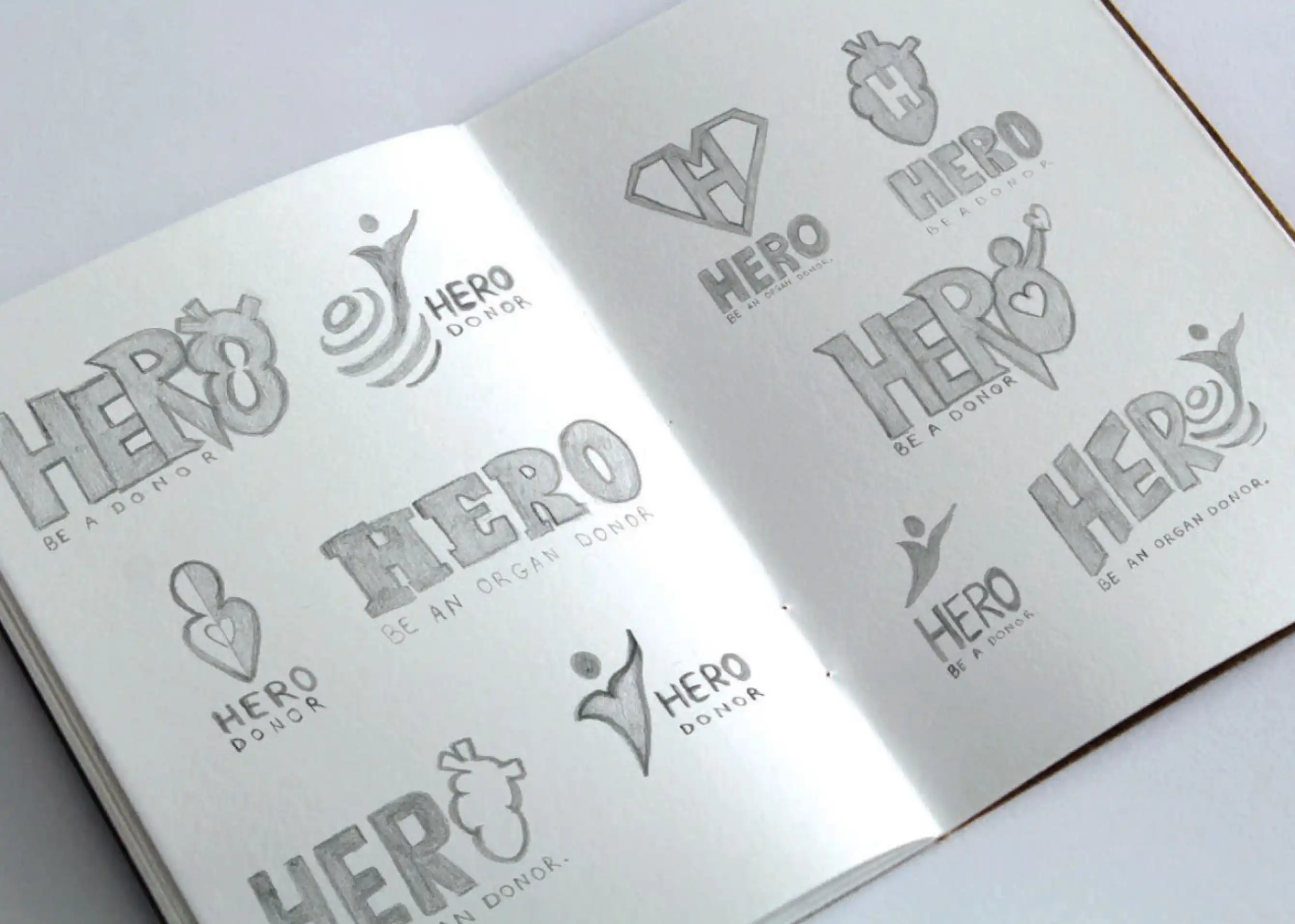
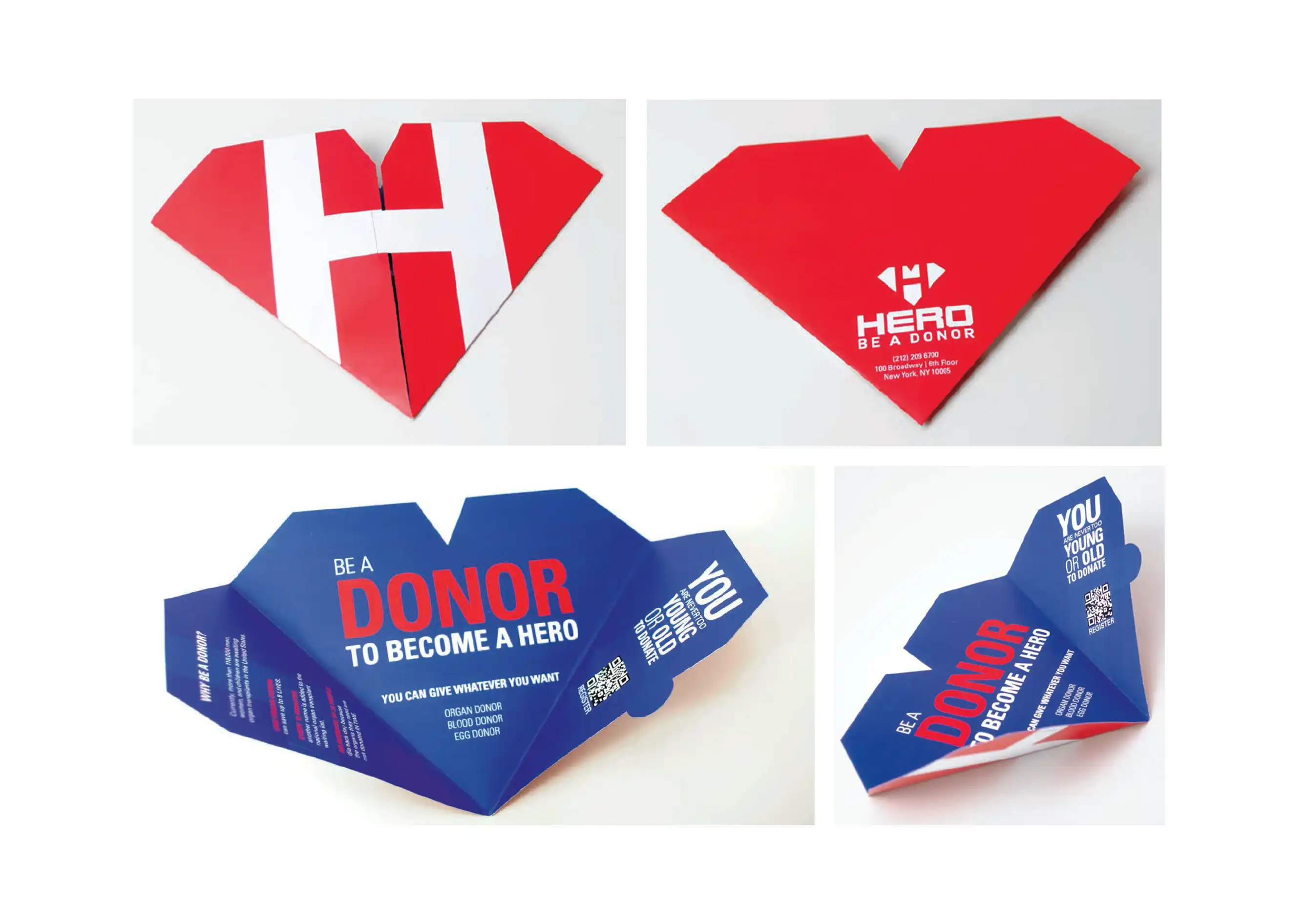
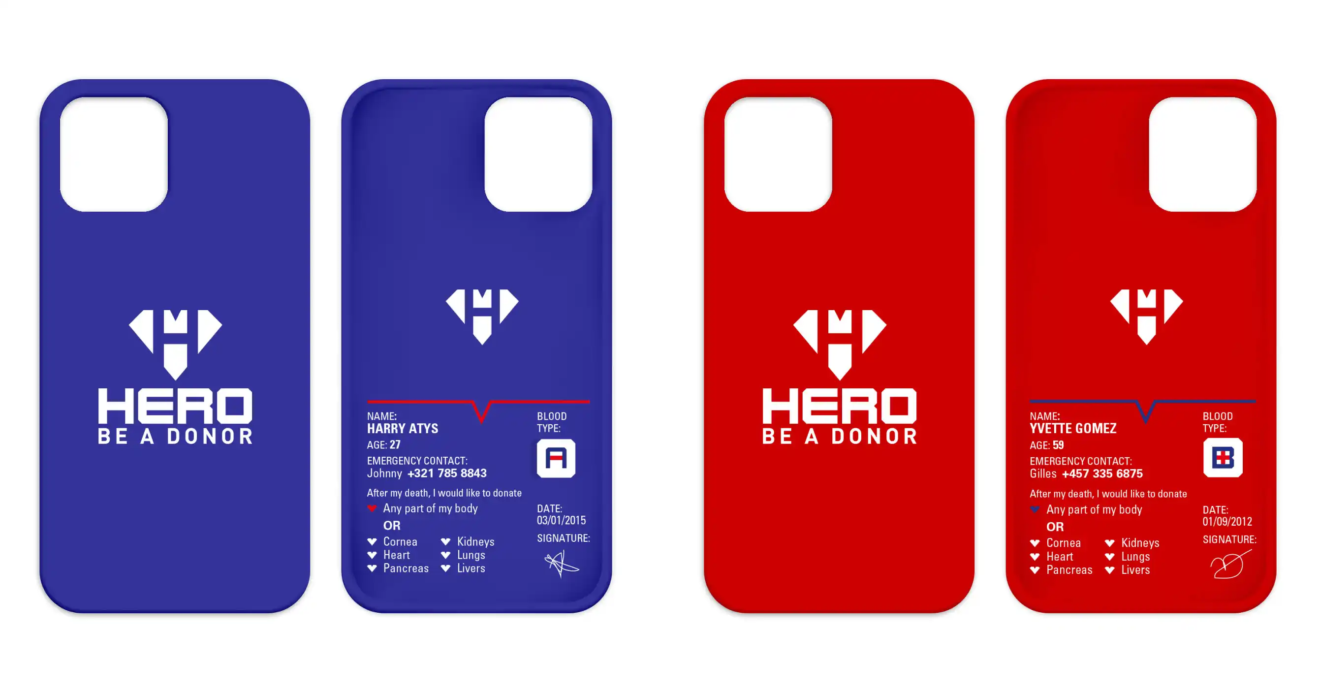
Design a brand identity for a donor-focused organization that communicates the life-saving impact of giving with clarity and emotional weight. The brand needed to position donors as everyday heroes, inspiring action and a genuine sense of purpose without relying on guilt or obligation as motivators.
The identity is built around the slogan "Be a Donor. Become a Hero." It reframes the act of donating as something empowering rather than obligatory, positioning each donor as an essential part of a larger mission. The messaging is direct and personal, connecting individual action to real, life-changing outcomes.
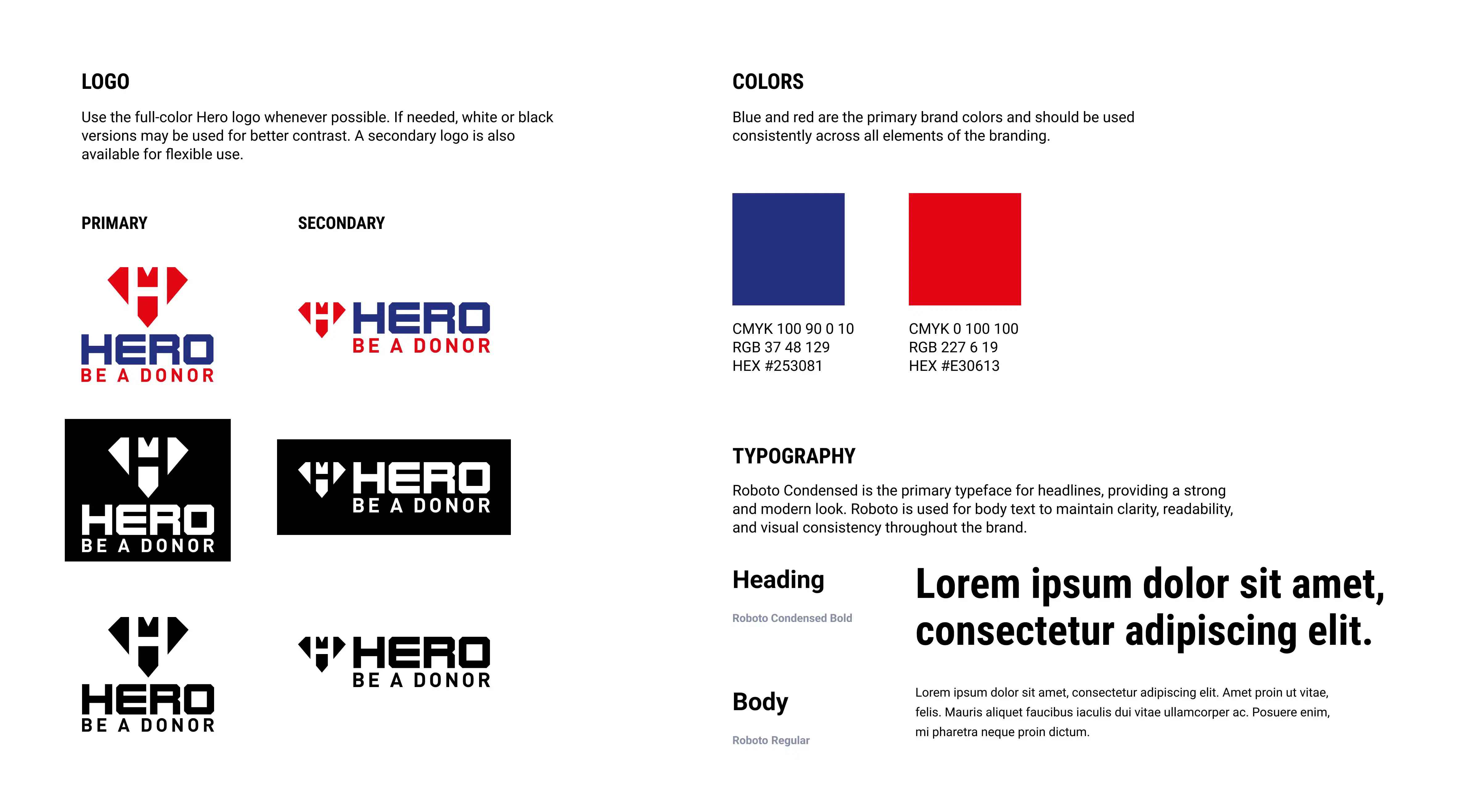
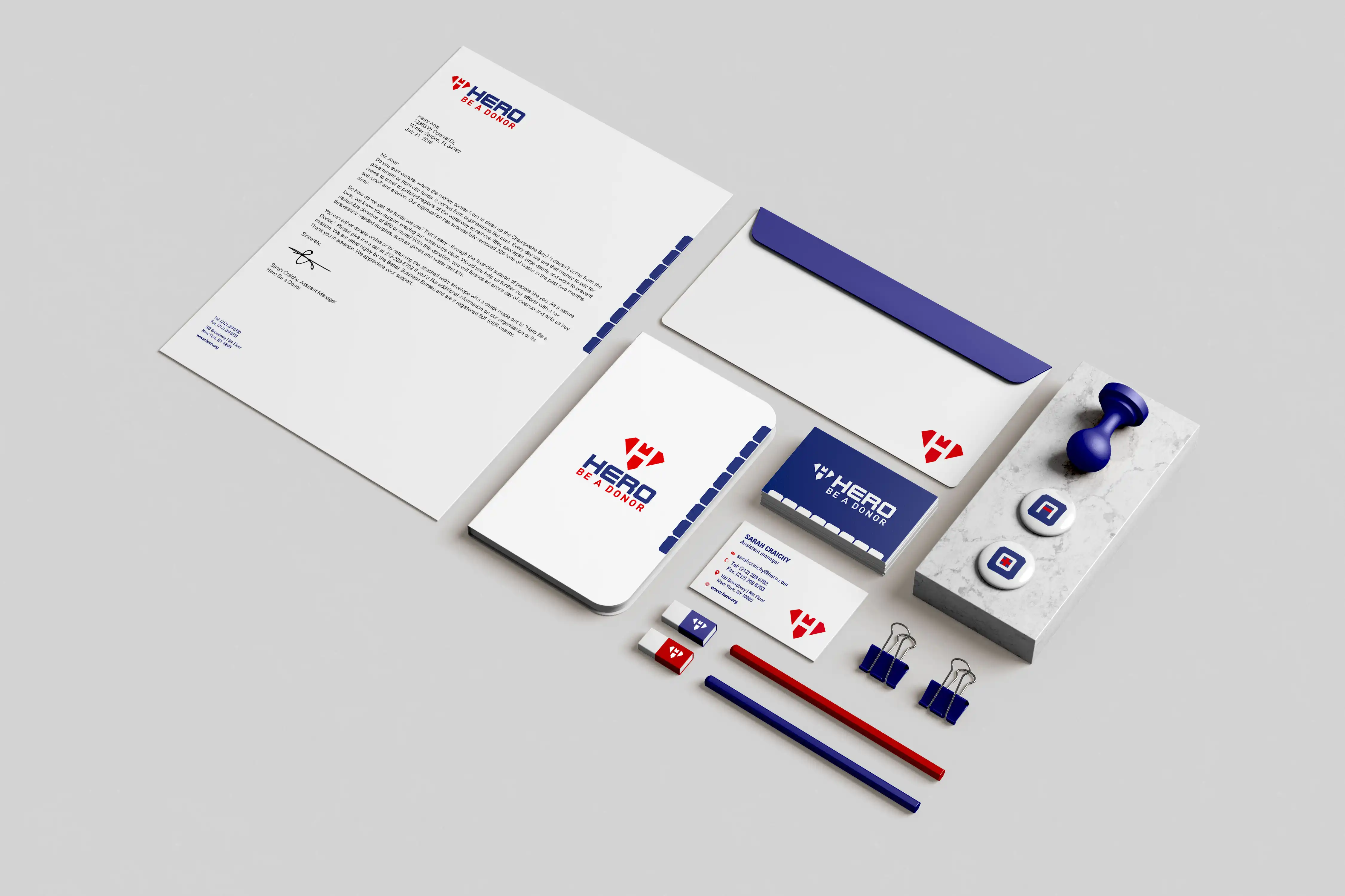
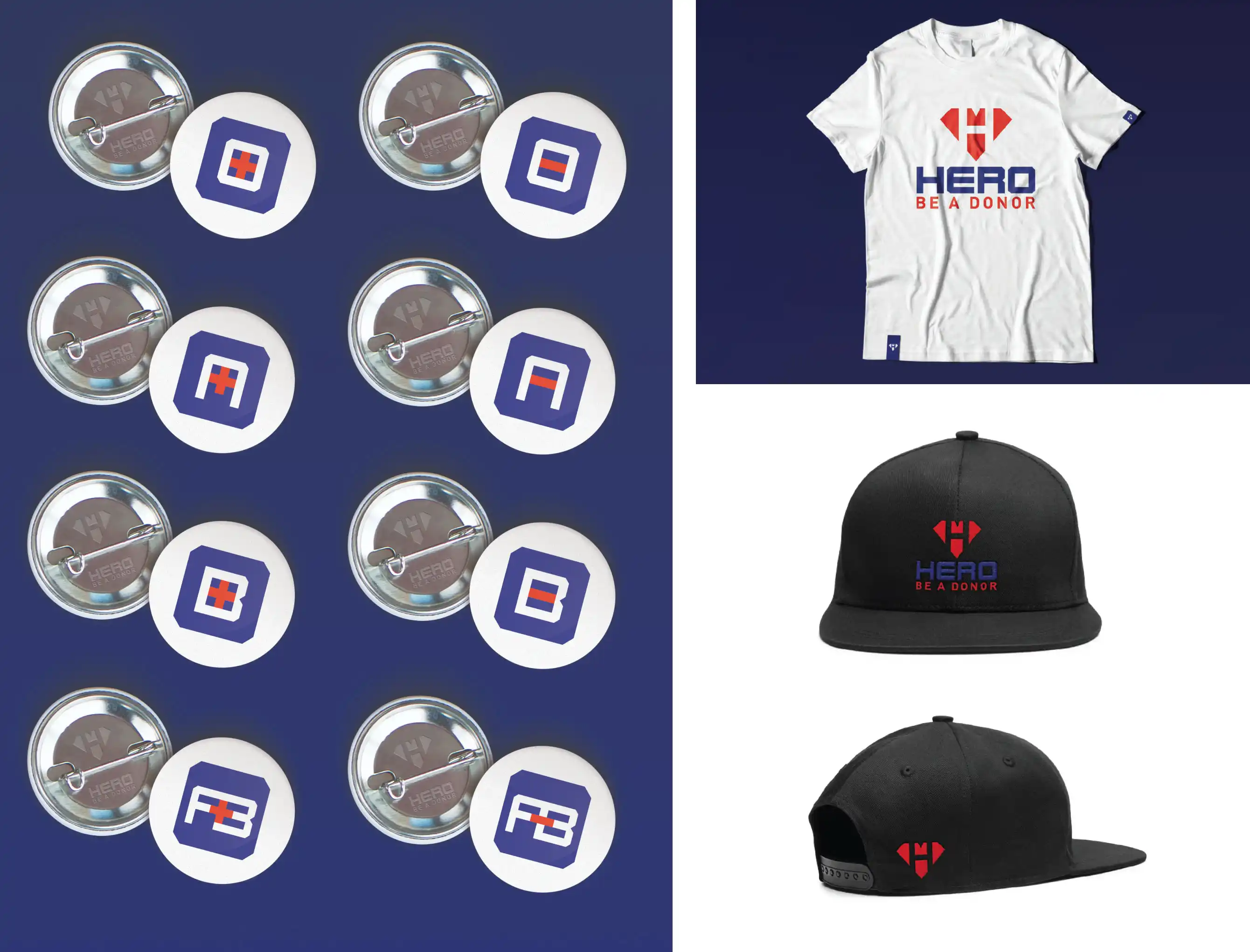
The visual system supports that message through confident, deliberate choices. Red communicates urgency and the life-saving nature of donations, while blue grounds the brand in trust and reliability. Together, the two colors create a palette that feels both energetic and credible. Bold, clean sans-serif typography reinforces clarity and strength, ensuring the brand reads with impact across print, digital, and social applications.
Every element of the system, from the logo to the collateral to the paid media, was designed to work together as a cohesive identity that scales across formats while maintaining its emotional resonance.
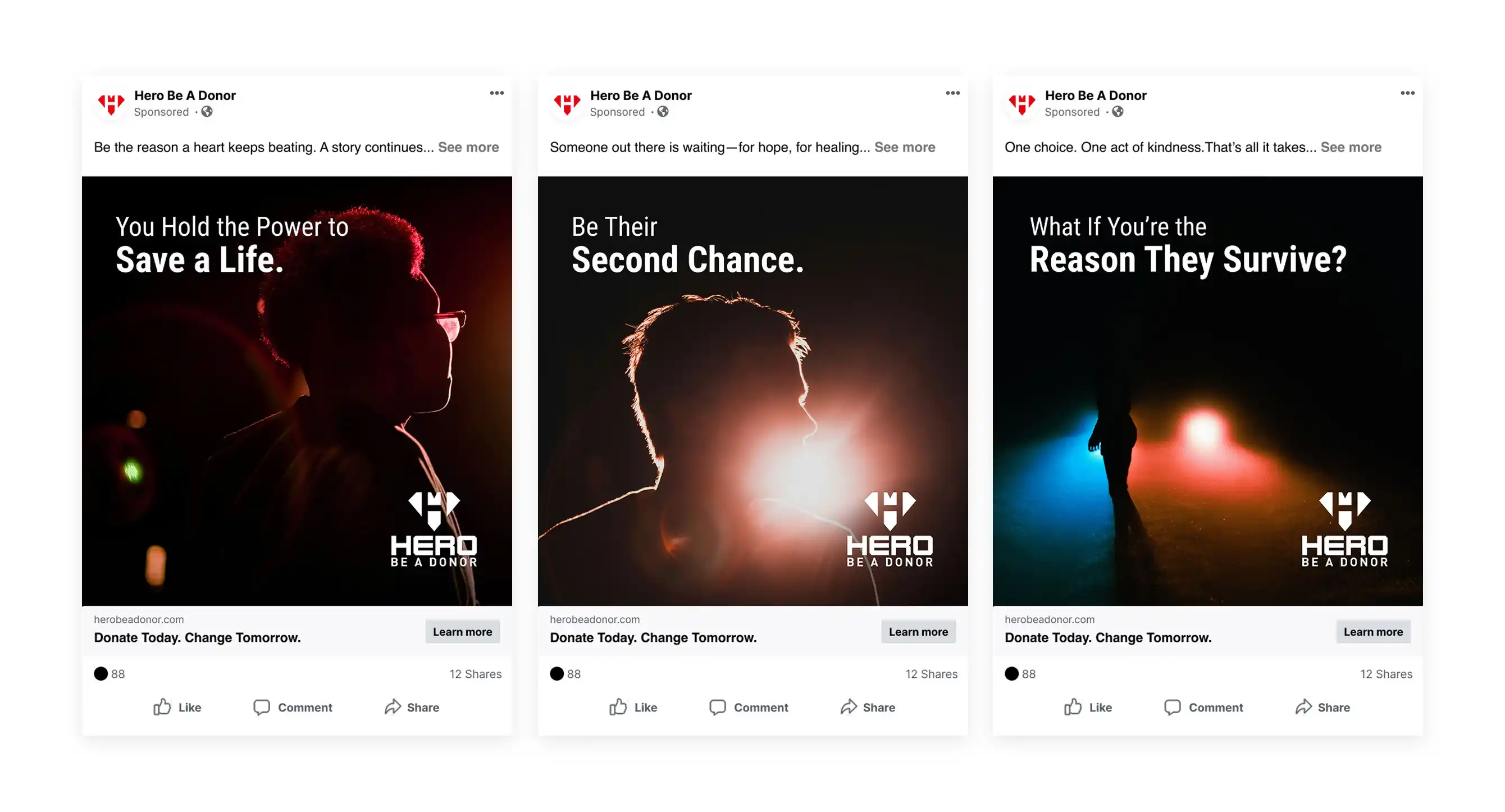
The completed identity delivers a recognizable, emotionally compelling brand presence across every format. The combination of strong visual hierarchy, purposeful color, and clear messaging creates a system that feels both urgent and trustworthy. By positioning donors as heroes, the brand builds a meaningful connection between the organization and its audience, one that encourages participation and supports long-term engagement.
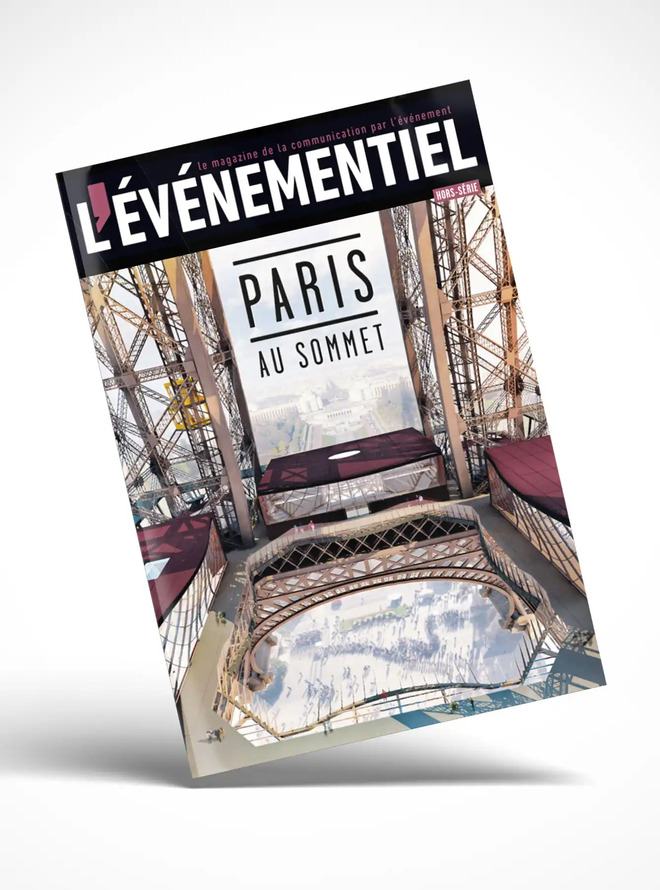
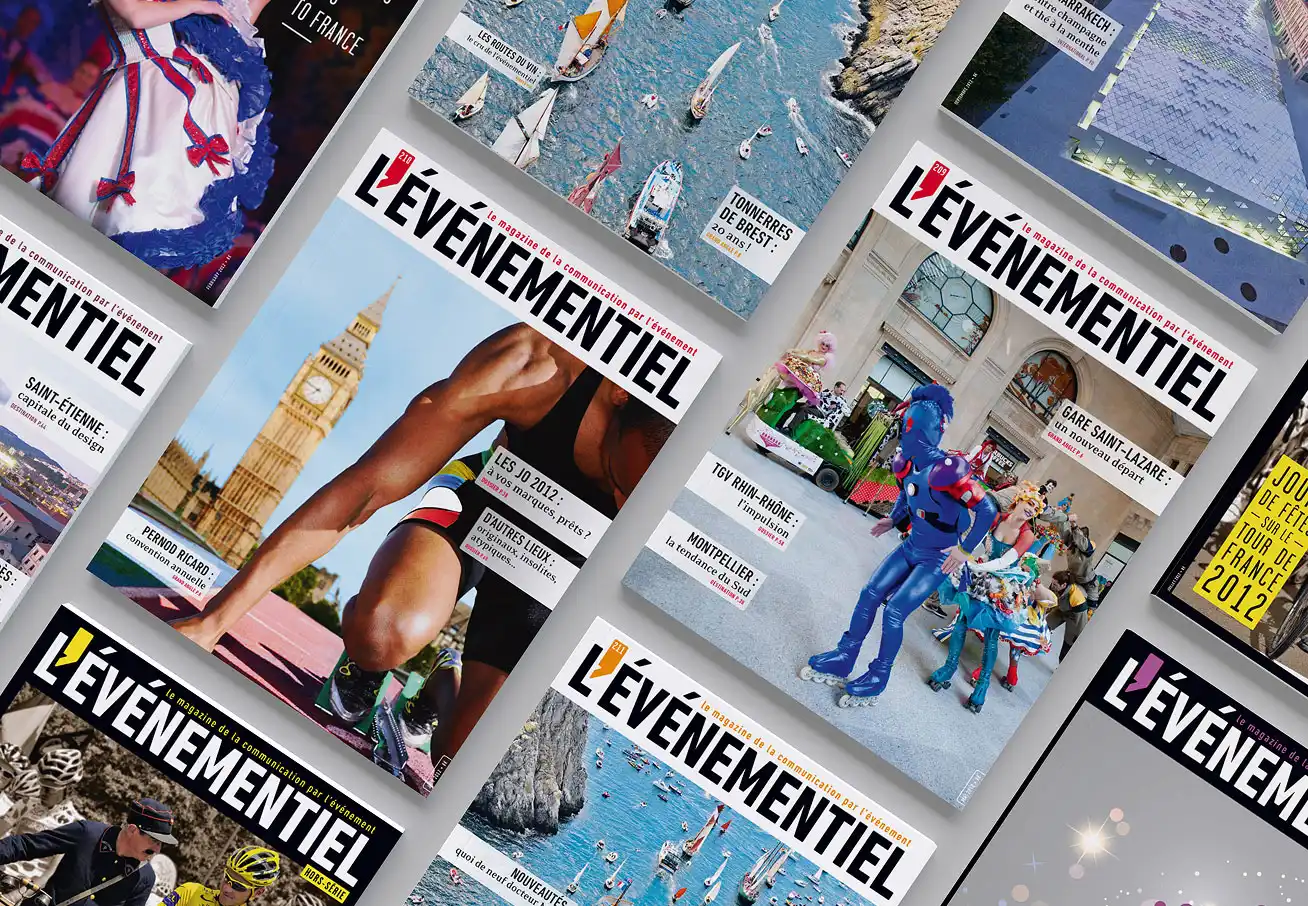
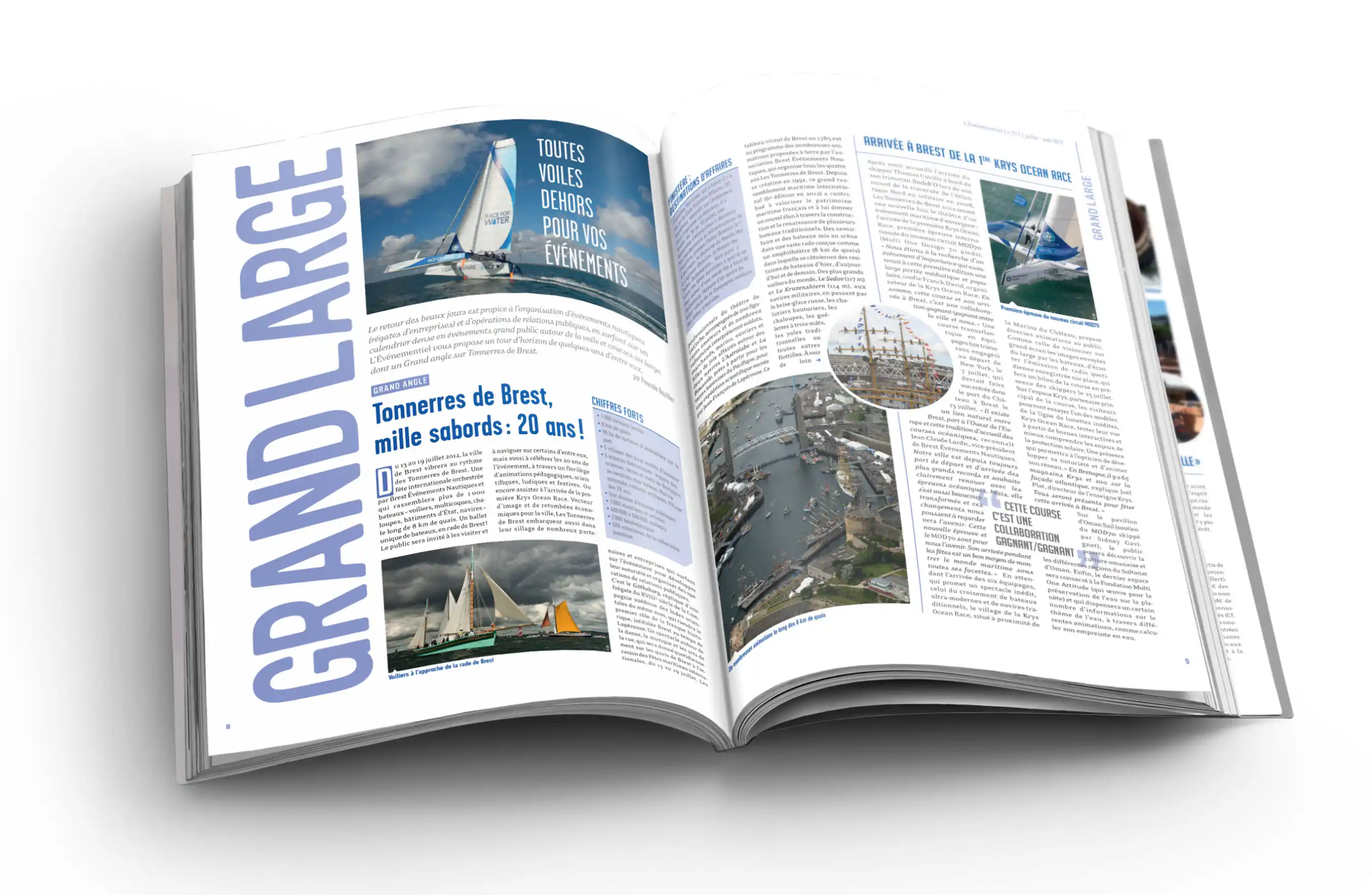
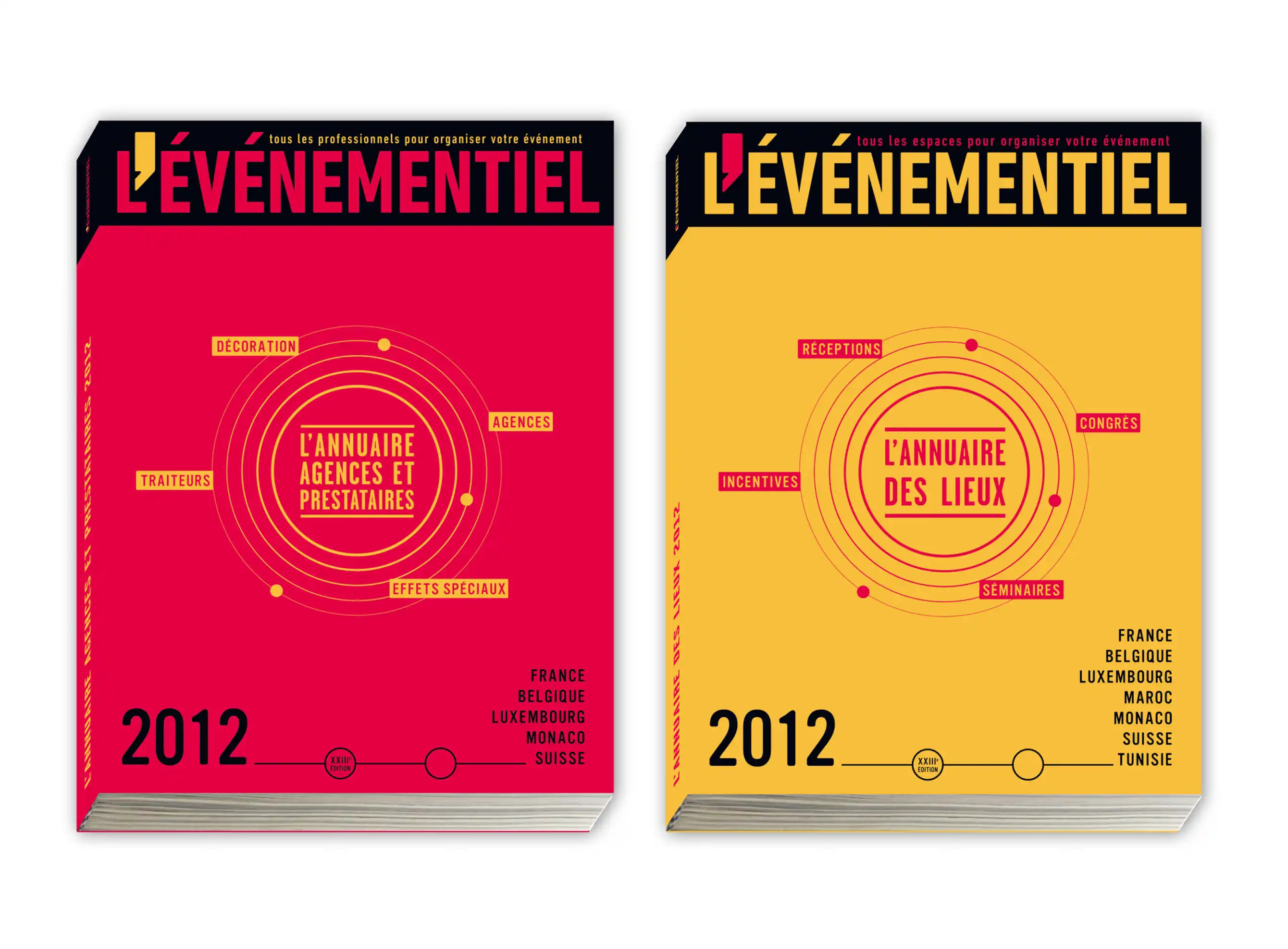
L'Événementiel is France's only monthly magazine dedicated entirely to the events industry, serving professionals across corporate and consumer sectors for over two decades. The publication covers industry trends, market developments, and practical insights for a broad readership including corporate clients, local authorities, institutions, associations, and event agencies.
The magazine is supported by two companion directories. The Venue Directory offers a comprehensive, free-to-access listing of medium- and large-capacity venues across France, French-speaking Europe, Morocco, and Tunisia. The Directory of Agencies and Service Providers lists professionals across the French-speaking events industry, giving corporations, agencies, and associations a reliable resource for sourcing partners.
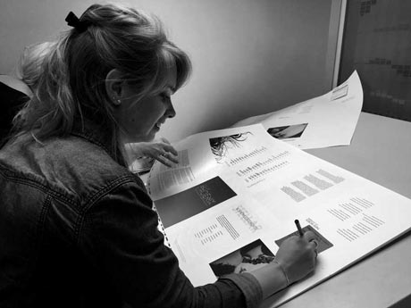
Working across the magazine, directories, and special editions (hors-séries) required managing multiple production streams simultaneously. The primary challenges were coordinating client approvals to keep print schedules on track, ensuring all advertising materials met technical print specifications, and maintaining consistent L'Événementiel branding across every publication format.
Managed end-to-end ad production across the magazine and companion directories, from client coordination to print-ready delivery. Maintained brand consistency across all formats and developed clear approval workflows to reduce revisions and keep production on schedule.
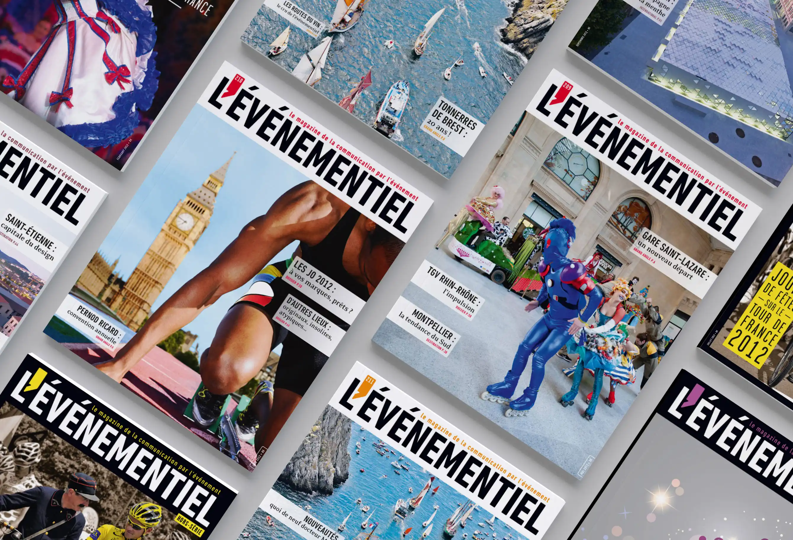
Consistent, on-time delivery across issues, directories, and special editions while maintaining brand integrity throughout. The structured approach to client coordination and production management contributed to a reliable publishing schedule and a cohesive brand presence across all L'Événementiel formats.
© 2026 Claire Atys. All rights reserved.